Data Formulator 2: Iterative Creation of Data Visualization s, with AI Transforming Data Along the Way
Data Formulator 2: 数据可视化的迭代创建,AI 在过程中转换数据
Chenglong Wang chenglong.wang@microsoft.com Microsoft Research Redmond, Washington, USA
陈龙 (Chenglong Wang) chenglong.wang@microsoft.com
微软研究院 (Microsoft Research)
美国华盛顿州雷德蒙德
Bongshin Lee b.lee@yonsei.ac.kr Yonsei University Seoul, Korea
Bongshin Lee b.lee@yonsei.ac.kr 延世大学 韩国首尔
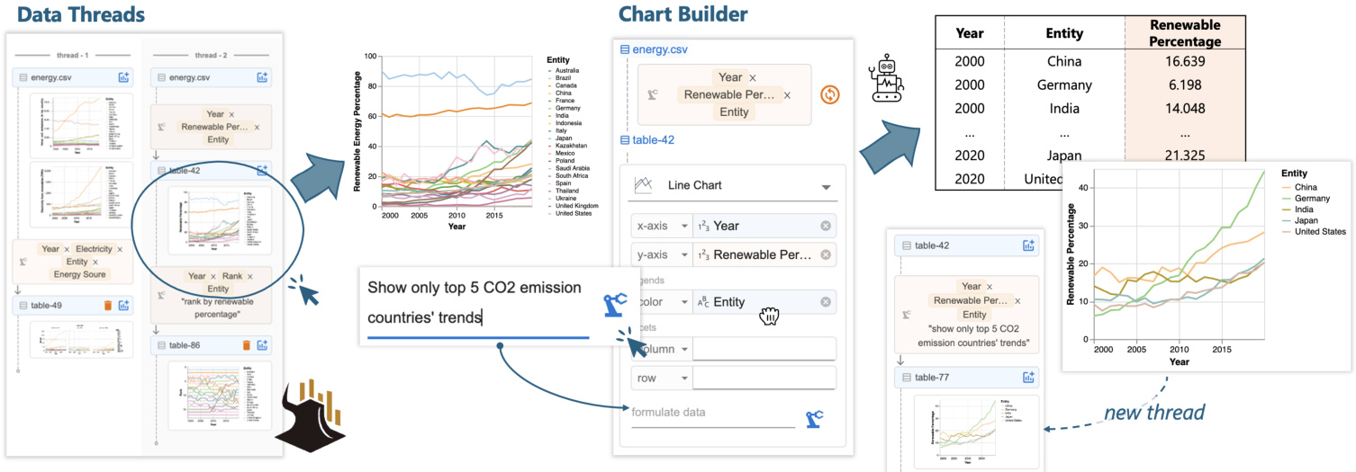
Figure 1: With Data Formulator 2, analysts can iterate on a previous design by (1) selecting a chart from data threads and (2) providing combined natural language and graphical user interface inputs in the chart builder to specify the new design. The AI model generates code to transform the data and update the chart. Data threads are updated with new charts for future use.
图 1: 使用 Data Formulator 2,分析师可以通过 (1) 从数据线程中选择一个图表,以及 (2) 在图表构建器中提供自然语言和图形用户界面输入的组合来指定新设计,从而迭代之前的设计。AI 模型生成代码来转换数据并更新图表。数据线程会更新为新的图表以供将来使用。
Abstract
摘要
Data analysts often need to iterate between data transformations and chart designs to create rich visualization s for exploratory data analysis. Although many AI-powered systems have been introduced to reduce the effort of visualization authoring, existing systems are not well suited for iterative authoring. They typically require analysts to provide, in a single turn, a text-only prompt that fully describe a complex visualization. We introduce Data Formulator 2 $\mathrm{D}\mathrm{_ {F2}}$ for short), an AI-powered visualization system designed to overcome this limitation. Df2 blends graphical user interfaces and natural language inputs to enable users to convey their intent more effectively, while delegating data transformation to AI. Furthermore, to support efficient iteration, $\mathrm{D}\mathrm{_{F}}2$ lets users navigate their iteration history and reuse previous designs, eliminating the need to start from scratch each time. A user study with eight participants demonstrated that Df2 allowed participants to develop their own iteration styles to complete challenging data exploration sessions.
数据分析师通常需要在数据转换和图表设计之间反复迭代,以创建丰富的可视化效果用于探索性数据分析。尽管已经引入了许多基于 AI 的系统来减少可视化创作的工作量,但现有系统并不太适合迭代式创作。它们通常要求分析师在单次交互中提供一个仅包含文本的提示,以完整描述复杂的可视化效果。我们引入了 Data Formulator 2(简称 $\mathrm{D}\mathrm{_ {F2}}$),这是一个基于 AI 的可视化系统,旨在克服这一限制。Df2 结合了图形用户界面和自然语言输入,使用户能够更有效地传达他们的意图,同时将数据转换任务委托给 AI。此外,为了支持高效迭代,$\mathrm{D}\mathrm{_{F}}2$ 允许用户浏览他们的迭代历史并重用之前的设计,从而避免了每次从头开始的麻烦。一项有八名参与者参与的用户研究表明,Df2 使参与者能够开发自己的迭代风格,以完成具有挑战性的数据探索任务。
CCS Concepts • Human-centered computing $\rightarrow$ Visualization systems and tools; $\bullet$ Computing methodologies $\rightarrow$ Artificial intelligence.
CCS 概念 • 以人为中心的计算 $\rightarrow$ 可视化系统和工具; $\bullet$ 计算方法 $\rightarrow$ 人工智能。
ACM Reference Format:
ACM 参考格式:
Chenglong Wang, Bongshin Lee, Steven Drucker, Dan Marshall, and Jianfeng Gao. 2025. Data Formulator 2: Iterative Creation of Data Visualization s, with AI Transforming Data Along the Way. In CHI Conference on Human Factors in Computing Systems (CHI ’25), April 26-May 1, 2025, Yokohama, Japan. ACM, New York, NY, USA, 17 pages. https://doi.org/10.1145/3706598.3713296
Chenglong Wang, Bongshin Lee, Steven Drucker, Dan Marshall, 和 Jianfeng Gao. 2025. Data Formulator 2: 数据可视化的迭代创建,AI 在过程中转换数据。在 CHI 计算系统人因会议 (CHI ’25) 上,2025 年 4 月 26 日至 5 月 1 日,日本横滨。ACM,纽约,纽约州,美国,17 页。https://doi.org/10.1145/3706598.3713296
1 Introduction
1 引言
In data exploration [47], even when starting with an initial idea, analysts often need to go back and forth exploring a variety of charts before reaching their goals. Throughout this iterative process, analysts often discover insights that lead them into new directions. However, analysts need to tackle numerous execution challenges:
在数据探索 [47] 中,即使从初始想法开始,分析师通常也需要反复探索各种图表才能达到目标。在这个迭代过程中,分析师经常会发现一些洞察,从而引导他们进入新的方向。然而,分析师需要应对许多执行上的挑战:
in addition to varying chart specifications (as many current tools facilitate), they need to perform and manage different data transformations to support the desired visualization designs. For example, when exploring renewable energy trends, an analyst may find that similar trends across countries make a simple line chart (Figure 1) too dense for detailed comparisons. This observation prompts the analyst to explore the renewable percentage trends of the top 5 $\mathrm{\Delta},\mathrm{CO_{2}}$ emitters and how the rankings of these countries have changed over time. To execute the plan, the analyst needs different data transformations: the first requires filtering the data based on each country’s total $\mathrm{CO_{2}}$ emissions, and the second requires partitioning the data by year to compute each country’s ranking for that year.
除了不同的图表规范(许多现有工具已支持)外,他们还需要执行和管理不同的数据转换,以支持所需的可视化设计。例如,在探索可再生能源趋势时,分析师可能会发现各国之间的相似趋势使得简单的折线图(图 1)过于密集,难以进行详细比较。这一观察促使分析师探索前 5 大 $\mathrm{\Delta},\mathrm{CO_{2}}$ 排放国的可再生能源百分比趋势,以及这些国家的排名如何随时间变化。为了执行这一计划,分析师需要进行不同的数据转换:第一个转换需要根据每个国家的总 $\mathrm{CO_{2}}$ 排放量过滤数据,第二个转换需要按年份划分数据以计算每个国家在该年份的排名。
Because data transformation can be difficult to learn and execute, many AI-powered tools have been developed [2, 10, 31, 36, 57, 58]. These tools allow users to describe their goals using natural language and leverage AI models’ code generation capabilities [1, 5] to streamline data transformation and chart creation. Despite their success, current tools do not perform well in the iterative visualization authoring context. Most of them require analysts to provide, in a single turn, a text-only prompt that fully describes the complex visualization task to be performed, which is usually unrealistic for both users and models.
由于数据转换可能难以学习和执行,许多基于 AI 的工具被开发出来 [2, 10, 31, 36, 57, 58]。这些工具允许用户使用自然语言描述他们的目标,并利用 AI 模型的代码生成能力 [1, 5] 来简化数据转换和图表创建。尽管这些工具取得了成功,但在迭代的可视化创作环境中,当前的工具表现不佳。大多数工具要求分析师在单次交互中提供一个纯文本提示,以完整描述要执行的复杂可视化任务,这对用户和模型来说通常是不现实的。
• First, even though free-form text prompts provide unbounded expressiveness for users to describe their goals, they miss UI interactions’ precision and afford ances, making it difficult for users to clearly describe complex chart designs. For example, to fully elaborate a faceted bar chart design, the user needs a verbose prompt to clearly specify visual encodings; without it, AI models often misinterpret the intent and create undesired charts, thus requiring further disambiguation efforts from the user. In fact, writing high-quality prompts requires skill and effort. Even with clear goals, inexperienced users sometimes find it difficult to clearly describe their intent in texts [52, 69]. • Second, existing AI-powered tools do not accommodate branching or backtracking, behaviors that commonly occur in the iterative authoring process. Using single-turn text-to-vis tools iterative ly requires users to re-specify their intent from scratch for each new design, even for minor updates. This also increases the likelihood of the AI model failing, as it must solve a complex task in a single attempt. While chat-based tools [31, 39, 72] support multi-turn interactions by reusing previous outputs, they struggle with branching contexts. Users often find it difficult to clearly specify which previous messages are relevant for the next iteration. With poorly specified contexts, models may struggle at retrieving important information from the lengthy conversation history to complete the task [17, 26, 70].
• 首先,尽管自由形式的文本提示为用户提供了无限的表达能力来描述他们的目标,但它们缺乏用户界面交互的精确性和可操作性,使得用户难以清晰地描述复杂的图表设计。例如,要完全阐述一个分面条形图设计,用户需要一个冗长的提示来明确指定视觉编码;如果没有它,AI模型往往会误解意图并创建不希望的图表,从而需要用户进一步消除歧义。事实上,编写高质量的提示需要技巧和努力。即使有明确的目标,缺乏经验的用户有时也难以在文本中清晰地描述他们的意图 [52, 69]。
• 其次,现有的AI驱动工具不支持分支或回溯,这些行为在迭代创作过程中经常发生。使用单轮文本到视觉工具迭代地要求用户从头开始重新指定他们的意图,即使是对小的更新也是如此。这也增加了AI模型失败的可能性,因为它必须一次性解决一个复杂的任务。虽然基于聊天的工具 [31, 39, 72] 通过重用先前的输出来支持多轮交互,但它们在分支上下文方面存在困难。用户通常难以明确指定哪些先前的消息与下一次迭代相关。在上下文指定不当的情况下,模型可能难以从冗长的对话历史中检索重要信息以完成任务 [17, 26, 70]。
To address these iterative chart authoring challenges, our first key insight is to design a multi-modal chart builder that blends the shelf-configuration UI [45, 58] with natural language (NL) input to enhance users’ ability to structurally specify their chart designs. Resembling traditional shelf-configuration UIs, the chart builder lets user drag existing fields to corresponding visual channels to specify visual encodings. Additionally, users can type in field names that do not exist in the current data to express their intent for creating a visualization that requires data transformation. Coupled with a brief supplemental NL text that elaborates the design, the user can effectively communicate their goal to AI. Since the system can precisely extract chart configuration from the encoding shelf, the user doesn’t need a verbose prompt to explicitly explain the design. The AI model then leverages the combined inputs to generate data transformation code to prepare the data required for the chart.
为了解决这些迭代式图表创作挑战,我们的第一个关键见解是设计一个多模态图表构建器,将货架配置用户界面 [45, 58] 与自然语言 (NL) 输入相结合,以增强用户结构化指定其图表设计的能力。类似于传统的货架配置用户界面,图表构建器允许用户将现有字段拖放到相应的视觉通道中以指定视觉编码。此外,用户可以输入当前数据中不存在的字段名称,以表达他们创建需要数据转换的可视化的意图。结合简要的补充自然语言文本,用户可以有效地向 AI 传达他们的目标。由于系统可以从编码货架中精确提取图表配置,用户不需要冗长的提示来明确解释设计。然后,AI 模型利用组合输入生成数据转换代码,以准备图表所需的数据。
Our second key insight is to introduce data threads for users to steer iteration directions. Data threads represent user’s non-linear authoring history, allowing users to navigate to an earlier result, fork a new branch, and ask AI to create charts based on that context. This reduces users’ input overhead by allowing them to specify incremental updates from a previous result (e.g., “show only top 5 $\mathrm{CO_{2}}$ emission countries’ trends”, Figure 1) rather than re-describing the full chart design from scratch. This design also benefits the AI models: the model can reuse previously generated code for new tasks to avoid repeating past mistakes, and it remains free from distractions caused by irrelevant messages from other threads. Data threads also provide a shortcut for users to backtrack and revise prompts to update recently created charts, allowing them to quickly clarify ambiguous inputs or fix errors made by AI.
我们的第二个关键见解是引入数据线程,使用户能够引导迭代方向。数据线程代表了用户的非线性创作历史,允许用户导航到早期结果,分叉一个新分支,并要求AI基于该上下文创建图表。这通过允许用户从先前结果中指定增量更新(例如,“仅显示前5个$\mathrm{CO_{2}}$排放国家的趋势”,图1)来减少用户的输入开销,而不是从头重新描述完整的图表设计。这种设计也对AI模型有益:模型可以重用先前生成的代码来执行新任务,以避免重复过去的错误,并且不受其他线程中无关消息的干扰。数据线程还为用户提供了一种快捷方式,可以回溯并修改提示以更新最近创建的图表,使他们能够快速澄清模糊的输入或修复AI犯下的错误。
Based on these designs, we developed Data Formulator 2 (Df2 for short), an AI-powered visualization tool for iterative visualization authoring. Df2 supports diverse charts powered by the Vega-Lite grammar [49], and the AI model can flexibly transform data for different designs, supporting operators like reshaping, filtering, aggregation, window functions, and column derivation. Like other AI tools [10, 58], Df2 provides users with panels to view generated data, transformation code and code explanations to inspect AI-generated contents. To understand how our new interaction designs benefit analysts in solving challenging data visualization s tasks, we conducted a user study consisting of eight participants with varying levels of data science expertise. They were asked to reproduce two professional data scientists’ analysis sessions to create a total of 16 visualization s, 12 of which require non-trivial data transformations (e.g., rank categories by a criterion and combine low-ranked ones into one category with the label, “Others”). The study shows that participants can quickly learn to use Df2 to solve these complex tasks, and the tool’s flexibility and expressiveness allow participants to develop their own iteration, verification, and error correction styles to complete the tasks. Our inductive analysis of study sessions reveals interesting patterns of how users’ experiences and expectations about the AI system affected their work styles. In summary, our main contributions are as follows:
基于这些设计,我们开发了 Data Formulator 2(简称 Df2),这是一个由 AI 驱动的可视化工具,用于迭代式可视化创作。Df2 支持由 Vega-Lite 语法 [49] 驱动的多种图表,AI 模型可以灵活地转换数据以适应不同的设计,支持重塑、过滤、聚合、窗口函数和列派生等操作符。与其他 AI 工具 [10, 58] 类似,Df2 为用户提供了面板,用于查看生成的数据、转换代码和代码解释,以便检查 AI 生成的内容。为了了解我们的新交互设计如何帮助分析师解决具有挑战性的数据可视化任务,我们进行了一项用户研究,参与者包括八位具有不同数据科学专业水平的人员。他们被要求重现两位专业数据科学家的分析会话,以创建总共 16 个可视化,其中 12 个需要非平凡的数据转换(例如,按标准对类别进行排名,并将排名较低的类别合并为一个带有“其他”标签的类别)。研究表明,参与者可以快速学会使用 Df2 来解决这些复杂任务,该工具的灵活性和表达能力使参与者能够开发自己的迭代、验证和错误纠正风格以完成任务。我们对研究会话的归纳分析揭示了用户对 AI 系统的经验和期望如何影响其工作风格的有趣模式。总之,我们的主要贡献如下:

Top 5 CO2 emission countries' trends Annotation with global median percentage Figure 2 shows Megan’s data analysis session with three branches. She starts with two basic line charts (chart ① -A,B) showing renewable energy and CO2 emission trends. Megan observes that many countries’ CO2 emissions have increased despite increased renewable energy use, prompting her to create a faceted line chart (chart ② ) and visualize renewable energy percentage trends (chart ③ ). Discovering that renewable percentage is a better indicator for global sustainability trends, Megan explores two directions: creating a line chart of countries’ renewable percentage ranks (chart ④ ) and highlighting the top 5 CO2 emitters’ trends (chart ⑤ ) compared to global median values (chart ⑥ ). Throughout the process, Megan backtracks several times to fork new branches from a previous version of data (e.g., charts ② to ③ , and ④ to ⑤ ) and reuses existing results to create new charts (e.g., chart ⑥ from ⑤ ).
前五大二氧化碳排放国的趋势与全球中位数百分比的注释 图 2 展示了 Megan 的数据分析会话,包含三个分支。她首先绘制了两个基本的折线图(图表 ① -A,B),展示了可再生能源和二氧化碳排放的趋势。Megan 观察到,尽管许多国家的可再生能源使用量增加,但二氧化碳排放量仍在上升,这促使她创建了一个分面折线图(图表 ②)并可视化了可再生能源百分比的趋势(图表 ③)。发现可再生能源百分比是衡量全球可持续性趋势的更好指标后,Megan 探索了两个方向:绘制各国可再生能源百分比排名的折线图(图表 ④)并突出显示前五大二氧化碳排放国的趋势(图表 ⑤),与全球中位数进行比较(图表 ⑥)。在整个过程中,Megan 多次回溯,从数据的先前版本中分支出新的分支(例如,从图表 ② 到 ③,以及从图表 ④ 到 ⑤),并重用现有结果来创建新图表(例如,从图表 ⑤ 创建图表 ⑥)。
Figure 2: An analyst explores electricity from different energy sources, renewable percentage trends, and country rankings by renewable percentages using a dataset on $\mathbf{CO}_{2}$ and electricity for 20 countries (2000-2020, table 1). The analyst creates five data versions in three branches to support different chart designs. Df2 allows users to manage iteration directions and create rich visualization s using a blended UI and natural language inputs.
图 2: 一位分析师使用 20 个国家(2000-2020 年,表 1)的 $\mathbf{CO}_{2}$ 和电力数据集,探索了不同能源的电力、可再生能源百分比趋势以及按可再生能源百分比排名的国家。该分析师在三个分支中创建了五个数据版本,以支持不同的图表设计。Df2 允许用户通过混合 UI 和自然语言输入来管理迭代方向并创建丰富的可视化效果。
Illustrative Scenarios
示例场景
In this section, we describe scenarios to illustrate users’ experiences for creating a series of visualization s to explore global sustain a bility from a dataset of 20 countries’ energy generation from 2000 to 2020. The initial dataset, shown in Figure 2- ① , includes each country’s energy produced from three sources (fossil fuel, renewables, and nuclear) each year and annual $\mathrm{CO_{2}}$ emission value (the $\mathrm{{CO_{2}}}$ emission data only ranges from 2000 to 2019). We compare different experiences and skills required for a data analyst, Megan, to complete the analysis session shown in Figure 2 with different tools, computational notebooks versus Df2.
在本节中,我们描述了用户使用不同工具(计算笔记本与 Df2)创建一系列可视化图表以探索全球可持续性的场景。初始数据集如图 2- ① 所示,包含每个国家每年从三种能源(化石燃料、可再生能源和核能)产生的能源以及年度 $\mathrm{CO_{2}}$ 排放值($\mathrm{{CO_{2}}}$ 排放数据仅涵盖 2000 年至 2019 年)。我们比较了数据分析师 Megan 使用不同工具完成图 2 所示分析会话所需的不同经验和技能。
Exploration with computational notebooks. To complete the analysis in a computation notebook, Megan can use R libraries ggplot2 and tidyverse. To use ggplot2 to create charts, Megan needs to make sure that all data fields to be visualized on visual channels (e.g., $x,y$ -axes, color, facet) are columns in the input data, thus, Megan uses tidyverse to transform data when needed.
使用计算笔记本进行探索。为了在计算笔记本中完成分析,Megan 可以使用 R 语言库 ggplot2 和 tidyverse。为了使用 ggplot2 创建图表,Megan 需要确保所有要在视觉通道(例如 $x,y$ 轴、颜色、分面)上可视化的数据字段都是输入数据中的列,因此,Megan 在需要时使用 tidyverse 来转换数据。
Implementing these charts requires considerable data preparation efforts. While basic charts can be created by mapping existing data fields to visual channels (e.g., Year $\rightarrow x$ , Electricity from renewables $(\mathsf{T w h})\to y$ , Entity $\rightarrow$ color for chart ① -A), more complex charts ③-⑥ require different data transformations. For example, Megan needs to reshape the table with pivot longer to merge energy sources into a new field Electricity for the $y$ -axis (chart ② ); to rank countries by renewable percentage (chart ④ ), she partitions the data by year and uses rank; for charts ⑤ and ⑥ , she computes the global median using aggregation and merges the results with the previous table to surface all necessary fields.
实现这些图表需要大量的数据准备工作。虽然基本图表可以通过将现有数据字段映射到视觉通道来创建(例如,年份 $\rightarrow x$,可再生能源发电量 $(\mathsf{T w h})\to y$,实体 $\rightarrow$ 颜色用于图表 ① -A),但更复杂的图表 ③-⑥ 需要不同的数据转换。例如,Megan 需要使用 pivot longer 重塑表格,将能源来源合并到新的字段 Electricity 中,用于 $y$ 轴(图表 ②);为了按可再生能源百分比对国家进行排名(图表 ④),她按年份对数据进行分区并使用排名;对于图表 ⑤ 和 ⑥,她使用聚合计算全球中位数,并将结果与之前的表格合并,以展示所有必要的字段。
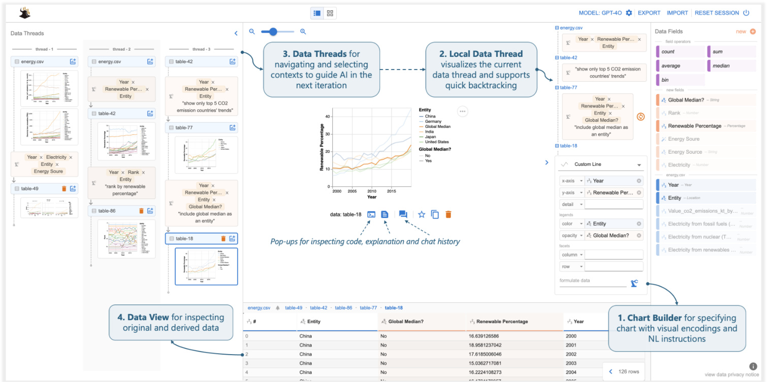
Figure 3: Df2 overview. Users create visualization s by providing fields (drag-and-drop or type) and NL instructions to the Chart Builder, delegating data transformation to AI. Data View shows derived data. Users navigate data history and select contexts for the next iteration using (the thread in use is displayed as local data threads). They refine or create new charts by providing instructions in Chart Builder. The main panel provides pop-up windows to inspect code, explanations, and chat history.
图 3: Df2 概览。用户通过向 Chart Builder 提供字段(拖放或输入)和自然语言指令来创建可视化,并将数据转换委托给 AI。数据视图显示派生数据。用户通过(使用的线程显示为本地数据线程)导航数据历史记录并选择上下文以进行下一次迭代。他们通过在 Chart Builder 中提供指令来优化或创建新图表。主面板提供弹出窗口以检查代码、解释和聊天历史记录。
Exploration with Df2. Using $\mathrm{D}\mathrm{_{F2}}$ to complete the same analysis session, Megan’s experience is quite different. Instead of transforming data and creating visualization s with code, Megan’s main task is to describe visualization goals with UI interactions and NL inputs and ask the AI model to realize them.
使用 Df2 进行探索。Megan 使用 $\mathrm{D}\mathrm{_{F2}}$ 完成相同的分析会话时,她的体验截然不同。与通过代码转换数据和创建可视化不同,Megan 的主要任务是通过 UI 交互和自然语言输入来描述可视化目标,并要求 AI 模型实现这些目标。
Megan starts with basic line charts to visualize trends of electricity from renewables (Figure 2- ① A). Since all three required fields are available from the input data, Megan simply selects the chart type “line chart” in the encoding shelf and drags and drops fields to their corresponding visual channels (Figure 4- ① ). Df2 then generates the desired visualization. To visualize the $\mathrm{CO_{2}}$ emission trends, Megan swaps the $y$ -axis encoding with CO2 emissions $(\mathsf{k t})\to y$ .
Megan 从基本的折线图开始,以可视化可再生能源电力的趋势(图 2- ① A)。由于输入数据中提供了所有三个必需的字段,Megan 只需在编码架中选择图表类型“折线图”,并将字段拖放到其对应的视觉通道中(图 4- ① )。然后 Df2 生成所需的可视化效果。为了可视化 $\mathrm{CO_{2}}$ 排放趋势,Megan 将 $y$ 轴编码与 CO2 排放量 $(\mathsf{k t})\to y$ 进行交换。
Megan now needs to create the faceted line chart to compare electricity from all energy sources, which requires new fields Electricity and Energy Source. With Df2, Megan can specify the chart using new data fields and NL instructions in the chart builder (Figure 3-2) and ask the AI to transform the data. As Figure 4- ② shows, Megan first drags and drops existing fields Year and Entity to the $x$ -axis and color, respectively. Then, she types in the names of new fields Electricity and Energy Source in the $y$ -axis and column, respectively, to indicate to the AI agent that she expects two new fields to be derived for these properties. Finally, Megan provides an instruction, “compare electricity from all three sources,” to further clarify the intent and clicks the formulate button. To create the chart, Df2 first generates a Vega-Lite spec skeleton from the encoding (to be completed based on information from the transformed data). It then summarizes the data, encodings, and NL instructions into a prompt to ask an AI model to generate data transformation code to prepare the data that fulfills all necessary fields, which is then used to instantiate the chart skeleton. After reviewing the generated chart and data, Megan is satisfied and moves to the next task. Df2 also updates data threads (Figure 3- ⑤ ) with the newly derived data and chart. With data threads, Megan can switch the iteration contexts to instruct the AI model to create a new chart either from scratch or reusing a previous result.
Megan 现在需要创建一个分面折线图来比较所有能源的电力数据,这需要新的字段 Electricity 和 Energy Source。使用 Df2,Megan 可以在图表构建器中指定新的数据字段和自然语言指令(图 3-2),并要求 AI 转换数据。如图 4- ② 所示,Megan 首先将现有字段 Year 和 Entity 分别拖放到 $x$ 轴和颜色上。然后,她分别在 $y$ 轴和列中输入新字段 Electricity 和 Energy Source 的名称,以向 AI 智能体表明她希望为这些属性派生两个新字段。最后,Megan 提供了指令“比较所有三种来源的电力”,以进一步澄清意图,并点击了 formulate 按钮。为了创建图表,Df2 首先从编码生成一个 Vega-Lite 规范骨架(基于转换后的数据信息完成)。然后,它将数据、编码和自然语言指令汇总成一个提示,要求 AI 模型生成数据转换代码,以准备满足所有必要字段的数据,然后用于实例化图表骨架。在查看生成的图表和数据后,Megan 感到满意并继续下一个任务。Df2 还使用新派生的数据和图表更新了数据线程(图 3- ⑤ )。通过数据线程,Megan 可以切换迭代上下文,指示 AI 模型从头开始创建新图表或重用之前的结果。
Megan proceeds to visualize renewable energy percentage. Although it requires a different data transformation, Megan’s experience is similar to the previous one: she drags-and-drops Year and Entity to $x$ -axis and color (Figure 4- ③ ), and enters the name of the new field “Renewable Energy Percentage” on the $y$ -axis. Since Megan believes the field names are self-explanatory, she formulates the new data without an additional NL instruction. $\mathrm{D}\mathrm{_{F}}2$ generates the desired visualization (Figure 5- ① ). To visualize the countries’ renewable percentage ranks, building on the previous data, Megan adds a new field “Rank” to the $y$ -axis and provides a short instruction. Because Megan builds the new chart on top of the previous data (note that in Figure 4- ③ , the chart builder box is positioned under the previous table-42 as opposed to energy.csv), the AI model has more contextual information to correctly derive the renewable percentage rank (Figure 2- ④ ) despite Megan’s simple inputs.
Megan 继续可视化可再生能源百分比。虽然这需要不同的数据转换,但 Megan 的体验与之前类似:她将 Year 和 Entity 拖放到 $x$ 轴和颜色 (图 4- ③),并在 $y$ 轴上输入新字段的名称“Renewable Energy Percentage”。由于 Megan 认为字段名称不言自明,因此她在没有额外自然语言指令的情况下生成了新数据。$\mathrm{D}\mathrm{_{F}}2$ 生成了所需的可视化 (图 5- ① )。为了可视化各国的可再生能源百分比排名,Megan 在之前的数据基础上,向 $y$ 轴添加了一个新字段“Rank”并提供了一个简短的指令。由于 Megan 是在之前的数据基础上构建新图表 (注意在图 4- ③中,图表构建器框位于之前的表-42 下方,而不是 energy.csv),AI 模型有更多的上下文信息来正确推导可再生能源百分比排名 (图 2- ④ ),尽管 Megan 的输入很简单。
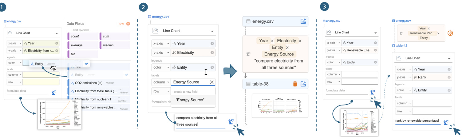
Figure 4: Experiences with Df2: (1) creating the basic renewable energy chart using drag-and-drop to encode fields; (2 and 3) creating charts requiring new fields by providing field names and optional natural language instructions to derive new data.
图 4: Df2 的使用体验:(1) 通过拖拽字段编码创建基本可再生能源图表;(2 和 3) 通过提供字段名称和可选的自然语言指令来创建需要新字段的图表。
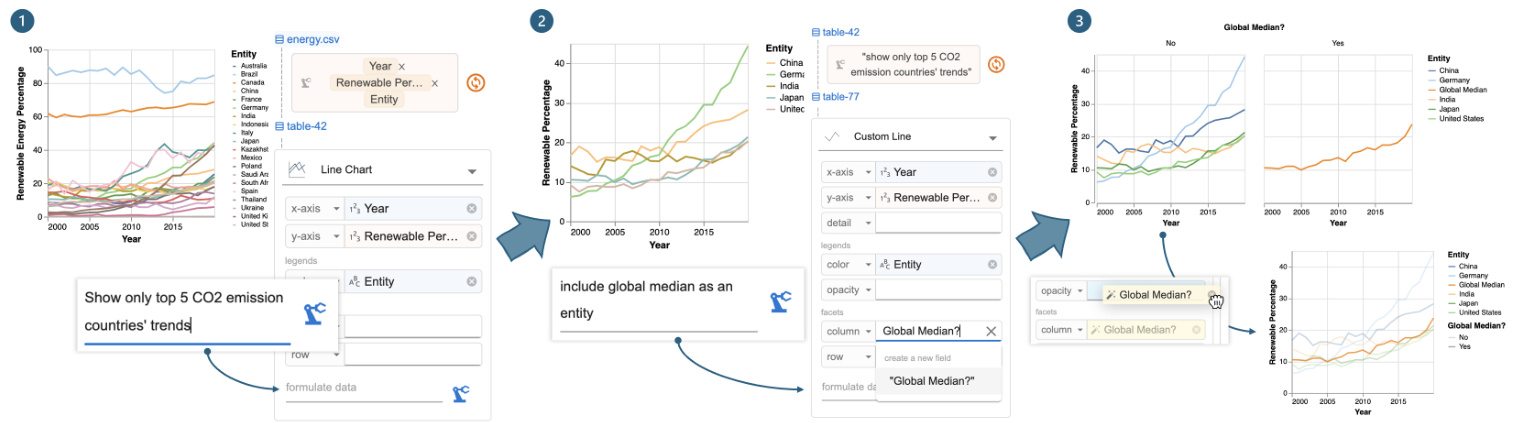
Figure 5: Iteration with Df2: (1) provide an instruction to filter the renewable energy percentage chart by top $\mathbf{CO}_ {2}$ countries, (2) update the chart with Global Median? and instruct Df2 to add the global median alongside the top 5 $\mathbf{CO}_{2}$ countries’ trends, and (3) move Global Median? from column to opacity to update the chart design without deriving new data.
图 5: 使用 Df2 进行迭代:(1) 提供一个指令,按二氧化碳排放量最高的国家筛选可再生能源百分比图表,(2) 使用全球中位数更新图表,并指示 Df2 在前 5 个二氧化碳排放量最高的国家趋势旁边添加全球中位数,(3) 将全球中位数从列移动到不透明度,以在不生成新数据的情况下更新图表设计。
Next, to visualize the renewable percentage trends of the top five $\mathrm{CO_{2}}$ emitting countries, Megan decides to build on a previous chart to avoid creating a verbose prompt from scratch. Megan first uses data threads (Figure 3- ⑤ ) to locate renewable percentage chart and opens it in the main panel. On top of that, Megan provides a new instruction below the local data thread, “show only top 5 CO2 emission countries’ trends,” and clicks the “derive” button (Figure 5- ① ). Df2 updates the previous code to include a filter clause to produce the new data and visualization (Figure 5- ② ). Finally, to annotate the chart with global median trends, Megan forks a branch by copying the previous chart, as the new chart requires different encodings (and she wants to keep both visualization s available). Megan updates the visual encoding by (1) typing in a new field name Global Median? for column and (2) providing the edit instruction “include global median as an entity” (Figure 5- ② ). Once she clicks the derive button, Df2 generates the new chart (Figure 5- ③ ). Upon inspection, Megan prefers to change the visualization type, with global average rendered in a different opacity as opposed to a different subplot. Since these two charts require the same data fields, Megan doesn’t need to interact with the AI model — she can directly update the design through the UI: first selecting a new chart type “custom line” (which exposes more chart properties than the basic line chart) and moving Global Median? to the opacity channel. With all desired charts created, Megan concludes the analysis session. Figure 3- ③ shows all the data threads from Megan.
接下来,为了可视化前五大二氧化碳排放国的可再生能源比例趋势,Megan 决定在之前的图表基础上进行构建,以避免从头创建一个冗长的提示。Megan 首先使用数据线程(图 3-⑤)定位到可再生能源比例图表,并在主面板中打开它。在此基础上,Megan 在本地数据线程下方提供了一个新的指令:“仅显示前五大二氧化碳排放国的趋势”,并点击了“派生”按钮(图 5- ①)。Df2 更新了之前的代码,加入了一个过滤子句,以生成新的数据和可视化(图 5- ②)。最后,为了在图表中标注全球中位数趋势,Megan 通过复制之前的图表分叉了一个分支,因为新图表需要不同的编码(并且她希望保留两个可视化)。Megan 通过以下方式更新了视觉编码:(1) 输入一个新的字段名称“Global Median?”作为列,(2) 提供编辑指令“将全球中位数作为一个实体包含进来”(图 5- ②)。点击派生按钮后,Df2 生成了新的图表(图 5- ③)。检查后,Megan 更倾向于更改可视化类型,将全球平均值以不同的不透明度呈现,而不是在不同的子图中呈现。由于这两个图表需要相同的数据字段,Megan 不需要与 AI 模型交互——她可以直接通过 UI 更新设计:首先选择一个新的图表类型“自定义折线图”(它比基本折线图暴露了更多的图表属性),然后将“Global Median?”移动到不透明度通道。在创建了所有所需的图表后,Megan 结束了分析会话。图 3- ③ 显示了 Megan 的所有数据线程。
Comparison of experiences. These two tools offer different experiences and skill requirements for Megan to execute the analysis. However, both enable her to iterative ly refine exploration goals and explore different branches to uncover insights.
体验对比。这两种工具为 Megan 执行分析提供了不同的体验和技能要求。然而,两者都使她能够迭代地细化探索目标,并探索不同的分支以发现洞察。
The main difference between the two experiences is data transformation. In computation notebooks, Megan needs to prepare data for design updates, even seemingly small ones (e.g., charts ③ and ⑤ ). She must understand the data shape required and apply the correct transformations (e.g., unpivot for table ② , join and union for table ⑥ ). Proficiency in data transformation is essential for creating rich visualization s. In Df2, Megan specifies high-level chart designs, and the AI implements the transformations. Regardless of the underlying data transformations, she conveys her intents uniformly through visual encodings (UI) and natural language inputs. Because Megan can use the shelf-configuration UI to specify chart design, the supplementary NL instruction is straightforward. Though Megan doesn’t write code, $\mathrm{D}\mathrm{F}2$ provides artifacts like generated data, charts, and code with natural language explanations for her to review. By lowering the implementation skill barrier, $\mathrm{D}\mathrm{F}2$ allows users to focus more on analysis planning and reasoning.
两种体验的主要区别在于数据转换。在计算笔记本中,Megan 需要为设计更新准备数据,即使是看似微小的更新(例如图表 ③ 和 ⑤)。她必须理解所需的数据形状并应用正确的转换(例如,对表 ② 进行逆透视,对表 ⑥ 进行连接和合并)。熟练掌握数据转换对于创建丰富的可视化至关重要。在 Df2 中,Megan 指定高级图表设计,AI 负责实现转换。无论底层数据转换如何,她都能通过视觉编码(UI)和自然语言输入统一传达意图。由于 Megan 可以使用货架配置 UI 来指定图表设计,因此补充的自然语言指令非常简单。尽管 Megan 不编写代码,但 $\mathrm{D}\mathrm{F}2$ 提供了生成的数据、图表和代码等工件,并附有自然语言解释供她审查。通过降低实现技能门槛,$\mathrm{D}\mathrm{F}2$ 让用户能够更专注于分析规划和推理。
Computation notebooks naturally support reuse. Megan can copy-edit previous code snippets or reuse variables to build new charts. In Df2, Megan directs the analysis using data threads. Megan can easily review the history and select previous results to instruct the AI model to create new charts from those contexts. This simplifies instructions to incremental updates, and the AI reuses previous outputs to avoid mistakes. If undesired results occur, she can backtrack and revise inputs using data threads (Figure 3- ③ ). Iteration isn’t as easy with a chat-based tool. Iteration isn’t as easy with a chat-based tool, where verbose prompts are needed to guide the AI and avoid unrelated histories.
计算笔记本天然支持重用。Megan 可以复制编辑之前的代码片段或重用变量来构建新图表。在 Df2 中,Megan 使用数据线程指导分析。Megan 可以轻松查看历史记录并选择之前的结果,以指示 AI 模型从这些上下文中创建新图表。这简化了增量更新的指令,AI 重用之前的输出以避免错误。如果出现不理想的结果,她可以使用数据线程回溯并修改输入(图 3- ③)。在基于聊天的工具中,迭代并不那么容易。在基于聊天的工具中,迭代并不那么容易,需要冗长的提示来引导 AI 并避免无关的历史记录。
3 System Design
3 系统设计
In this section, we present Df2’s system design. First, to enable users to specify their intent using multiple paradigms (shelf-configuration UI and NL inputs) Df2 decouples chart specification from data transformation, solving them with template instantiation and AI code generation respectively. Second, to support reuse, Df2 organizes the iteration history as data threads with data as first-class objects. This enables users to either locate a chart from a different branch and follow up or quickly revise and rerun the most recent instructions leading to the current chart. We will next detail how we implement these designs and explain how additional features help users understand AI-generated results.
在本节中,我们介绍 Df2 的系统设计。首先,为了让用户能够使用多种范式(配置界面和自然语言输入)来指定他们的意图,Df2 将图表规范与数据转换解耦,分别通过模板实例化和 AI 代码生成来解决这两个问题。其次,为了支持重用,Df2 将迭代历史组织为数据线程,并将数据作为一等对象。这使得用户可以从不同的分支中找到图表并继续操作,或者快速修改并重新运行导致当前图表的最新指令。接下来,我们将详细介绍如何实现这些设计,并解释附加功能如何帮助用户理解 AI 生成的结果。
3.1 Composing charts from multi-modal inputs
3.1 从多模态输入中组合图表
Figure 6 shows how Df2 decouples chart design and data transformation to support blended input methods. Given a user specification, Df2 generates the desired chart in three steps: (1) generate a Vega-Lite specification from the selected chart type, (2) compile a prompt and delegate data transformation to the AI, and (3) instantiate the Vega-Lite specification with the generated data.
图 6 展示了 Df2 如何将图表设计和数据转换解耦,以支持混合输入方法。给定用户规范,Df2 通过三个步骤生成所需的图表:(1) 从选定的图表类型生成 Vega-Lite 规范,(2) 编译提示并将数据转换委托给 AI,(3) 使用生成的数据实例化 Vega-Lite 规范。
Chart specification generation. Df2 adopts a chart type-based approach to represent visualization s, supporting five categories of charts: scatter (scatter plot, ranged dot plot), line (line chart, dotted line chart), bar (bar chart, stacked bar chart, grouped bar chart), statistics (histogram, heatmap, linear regression, boxplot) and custom (custom scatter, line, bar area, rectangle where all available visual channels are exposed). Each chart type is represented as a Vega-Lite template with a set of predefined visual channels, including position $(x,y)$ , legends (color, size, shape, opacity), and facet (column, row) that are shown to the user in the chart builder. For example, a line chart is represented as a Vega-Lite template { "mark": "line", "encoding" : $\left{\mathbf{"}\mathbf{X}^{\prime\prime}\colon\right.$ : null, "y": null, "color": null, "column": null, "row": null}}, and when the user selects line chart, channels $x$ , 𝑦, color, column, and row are displayed in the chart builder. Chart type-based design enable Df2 to support predefined layered charts (e.g., ranged dot plot composed from line and scatter, Figure 7). Additional chart types (e.g., bullet chart) can be supported by adding Vega-Lite templates with respective channels to the library.
图表规范生成。Df2 采用基于图表类型的方法来表示可视化,支持五类图表:散点图(散点图、范围点图)、折线图(折线图、点线图)、条形图(条形图、堆叠条形图、分组条形图)、统计图(直方图、热力图、线性回归、箱线图)和自定义(自定义散点图、折线图、条形图区域、矩形,其中所有可用的视觉通道都暴露出来)。每种图表类型都表示为一个 Vega-Lite 模板,其中包含一组预定义的视觉通道,包括位置 $(x,y)$ 、图例(颜色、大小、形状、不透明度)和分面(列、行),这些通道在图表构建器中显示给用户。例如,折线图表示为一个 Vega-Lite 模板 { "mark": "line", "encoding" : $\left{\mathbf{"}\mathbf{X}^{\prime\prime}\colon\right.$ : null, "y": null, "color": null, "column": null, "row": null}},当用户选择折线图时,通道 $x$ 、𝑦、颜色、列和行会显示在图表构建器中。基于图表类型的设计使 Df2 能够支持预定义的分层图表(例如,由折线图和散点图组成的范围点图,图 7)。通过向库中添加具有相应通道的 Vega-Lite 模板,可以支持其他图表类型(例如,子弹图)。
As the user inputs fields into the chart builder, either by dragging and dropping it from existing data fields or by typing in new fields they wish to visualize, $\mathrm{D}\mathrm{_{F}}2$ instantiate s the Vega-Lite template with provided fields. For example, as shown in Figure 6- 1 w, when the user drags Year $\rightarrow x$ , Entity $\to y$ and types Rank in $y$ , the line chart template mentioned above is instantiated with provided fields: if the field is available in the current data table, both field name and encoding type are instantiated (e.g., Year with the temporal type), otherwise the encoding type is left as a “
当用户通过从现有数据字段中拖放或输入他们希望可视化的新字段来向图表构建器输入字段时,$\mathrm{D}\mathrm{_{F}}2$ 会使用提供的字段实例化 Vega-Lite 模板。例如,如图 6-1 所示,当用户将 Year $\rightarrow x$、Entity $\to y$ 并输入 Rank 到 $y$ 时,上述折线图模板会使用提供的字段进行实例化:如果字段在当前数据表中可用,则字段名称和编码类型都会被实例化(例如,Year 带有时间类型),否则编码类型将保留为“
Data transformation with AI. From the chart builder, Df2 assembles a prompt and queries an LLM to generate python code to transform data. The data transformation prompt contains three segments: the system prompt, the data transformation context and the goal (illustrated Figure 6-⑨ .
使用 AI 进行数据转换。从图表构建器中,Df2 组装一个提示并查询大语言模型以生成用于转换数据的 Python语言 代码。数据转换提示包含三个部分:系统提示、数据转换上下文和目标(如图 6-⑨ 所示)。
The system prompt describes the role of the LLM and the output format. Besides generic role descriptions (i.e., LLM as a data scientist for data transformation), the system prompt guides the LLM to solve the data transformation task in two steps. First, the LLM should refine the user’s goal and output as a JSON object that elaborates intermediate and final fields to be computed from the original data. Then, the LLM should generate a python snippet following a provided template. The system prompt ends with an input-output example that illustrates the process. The design rationale behind the “goal refinement” step is to allow the LLM to reason about any potential discrepancy between users’ provided fields and their instruction (e.g., users may ask about color by energy type but didn’t put “energy type” on the color encoding) and determine the final list of fields to be computed. Df2 then assembles context prompts that illustrate the data to be transformed, explaining the data fields by showing the data type and example values for each field, along with sample table rows. The data context provides valuable information related to data formats (such as data types, string formats, and whether columns contain null values) to the LLM, ensuring that the generated transformation code is executable on the given data. When a chart is specified based on previous results, the dialog history between $\mathrm{D}\mathrm{_{F2}}$ and the LLM, including user instructions and previously generated code, is appended in context. This way, even if users’ follow-up prompts is short, the grounded contexts help the model understand user intent and reuse previously generated code. Finally, Df2 assembles a goal prompt, combining the NL instruction provided in the text box and field names used in the encodings. When users skip an NL instruction (Figure 4- $\Theta$ , the instruction part is left blank. This goal will be refined by the LLM (i.e., based on the system prompt) before attempting to generate the data transformation code. With the full input, Df2 prompts the LLM to generate a response. Below shows the LLM’s refined goal for the task in Figure 6, and the generated code is shown in Figure 6- 2 w.
系统提示描述了LLM的角色和输出格式。除了通用的角色描述(即LLM作为数据科学家进行数据转换),系统提示还指导LLM分两步解决数据转换任务。首先,LLM应细化用户的目标,并输出一个JSON对象,详细说明从原始数据中计算出的中间和最终字段。然后,LLM应按照提供的模板生成一个Python代码片段。系统提示以一个输入输出示例结束,展示了整个过程。“目标细化”步骤背后的设计原理是允许LLM推理用户提供的字段与其指令之间的任何潜在差异(例如,用户可能要求按能源类型显示颜色,但没有将“能源类型”放在颜色编码中),并确定要计算的最终字段列表。Df2随后组装上下文提示,说明要转换的数据,通过显示每个字段的数据类型和示例值以及示例表行来解释数据字段。数据上下文为LLM提供了与数据格式相关的宝贵信息(如数据类型、字符串格式以及列是否包含空值),确保生成的转换代码在给定数据上可执行。当基于先前结果指定图表时,$\mathrm{D}\mathrm{_{F2}}$与LLM之间的对话历史(包括用户指令和先前生成的代码)会被附加到上下文中。这样,即使用户的后续提示很短,基于上下文的提示也能帮助模型理解用户意图并重用先前生成的代码。最后,Df2组装一个目标提示,结合文本框中提供的自然语言指令和编码中使用的字段名称。当用户跳过自然语言指令时(图4-$\Theta$),指令部分留空。在尝试生成数据转换代码之前,LLM将根据系统提示细化此目标。有了完整的输入,Df2提示LLM生成响应。下图展示了LLM对图6中任务的细化目标,生成的代码如图6-2w所示。
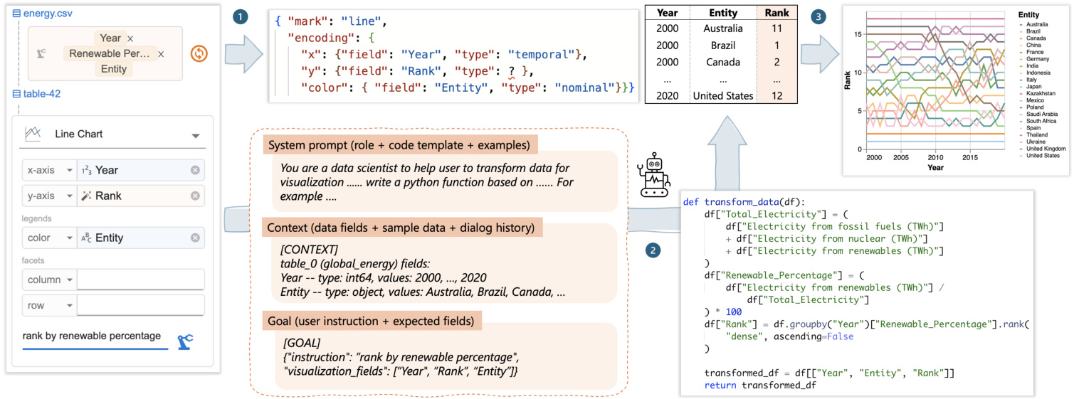
Figure 6: Df2’s workflow: (1) Df2 generates a Vega-Lite spec skeleton based on user specifications and chart type. (2) If new fields (e.g., Rank) are required, Df2 prompts its AI model to generate data transformation code. (3) The Vega-Lite skeleton is then instantiated with the new data to produce the desired chart.
图 6: Df2 的工作流程:(1) Df2 根据用户规范和图表类型生成 Vega-Lite 规范骨架。(2) 如果需要新字段(例如 Rank),Df2 会提示其 AI 模型生成数据转换代码。(3) 然后使用新数据实例化 Vega-Lite 骨架以生成所需的图表。
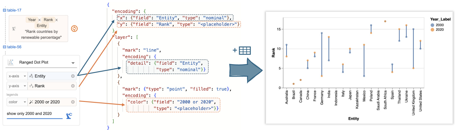
Figure 7: Df2 converts user encodings into a Vega-Lite specification, which is combined with AI-transformed data to visualiz country ranks in 2000 and 2020.
图 7: Df2 将用户编码转换为 Vega-Lite 规范,该规范与 AI 转换的数据结合,以可视化 2000 年和 2020 年的国家排名。
Df2 then runs the code on the input data. If the code executes without errors, the output data is used to instantiate the Vega-Lite script generated in the previous step. This is done by first inferring semantic types of newly generated columns (to determine their encoding type), and then assembling the data with the script to render the visualization (Figure $6\cdot\Theta)$ ). The generated code sometimes causes runtime errors due to an attempt to use libraries that are not imported, references to invalid columns names, or incorrect handling of undefined or NaN values. When such errors occur, Df2 tries to correct the errors by querying the LLM with the error message and a follow-up instruction to repair its mistakes [9, 38]. The visualization is generated when repair completes. Df2 updates the data threads upon creating the chart.
Df2 随后在输入数据上运行代码。如果代码执行无误,输出数据将用于实例化上一步生成的 Vega-Lite 脚本。首先推断新生成列的语义类型(以确定其编码类型),然后将数据与脚本组合以渲染可视化(图 $6\cdot\Theta)$)。生成的代码有时会因尝试使用未导入的库、引用无效的列名或错误处理未定义或 NaN 值而导致运行时错误。当此类错误发生时,Df2 会通过向大语言模型发送错误消息和后续指令来尝试纠正错误 [9, 38]。修复完成后生成可视化。Df2 在创建图表时更新数据线程。
3.2 Data threads
3.2 数据线程
Data threads visualize the analyst’s interaction history with AI, allowing the analyst to control the iteration direction by selecting which data or chart the AI model should use to generate new charts. In data threads, each node represents a version of the data, and these nodes are connected by edges that represent the user’s instructions provided to the AI model for data transformation. Visualization s are attached to the data from which they were created. Centering the iteration history around data benefits user navigation because it reflects the sequence of user actions in creating these new data.
数据线程可视化分析师与 AI 的交互历史,使分析师能够通过选择 AI 模型应使用哪些数据或图表来生成新图表,从而控制迭代方向。在数据线程中,每个节点代表数据的一个版本,这些节点通过边连接,边代表用户提供给 AI 模型的数据转换指令。可视化结果附加到生成它们的数据上。将迭代历史围绕数据为中心有助于用户导航,因为它反映了用户创建这些新数据的操作顺序。
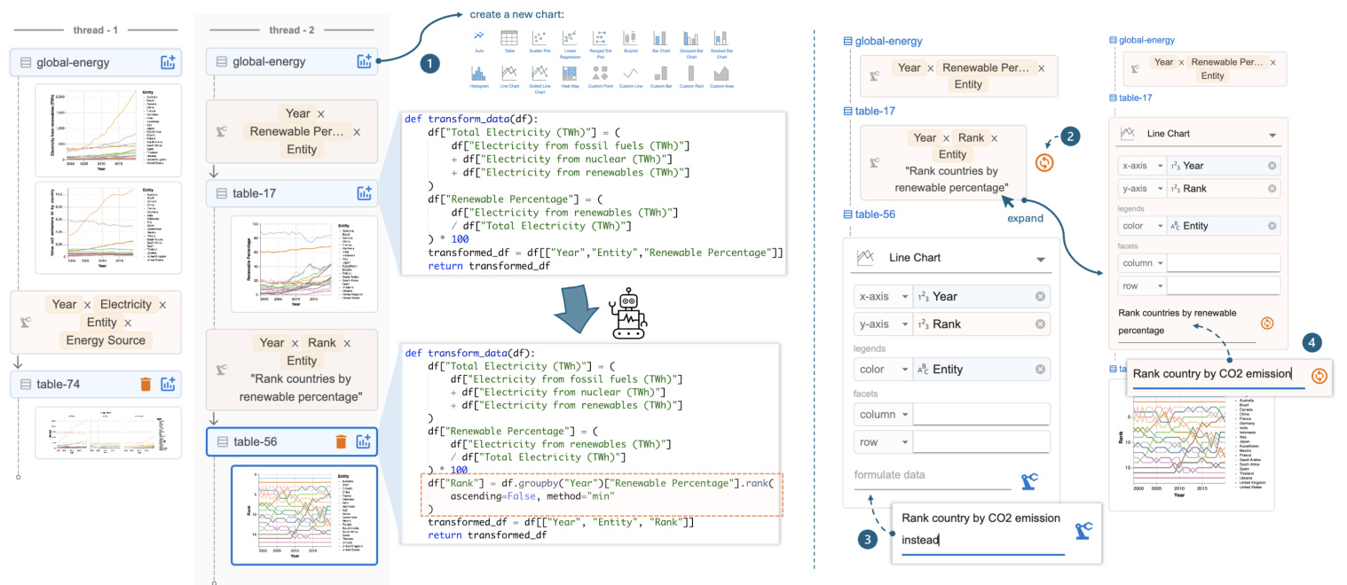
Figure 8: Data threads and local data threads (right). Users can select previous data or charts to create new branches, and the AI reuses code for new transformations based on user instructions. The local data thread offers shortcuts to (1) rerun the previous instruction, (2) issue a follow-up instruction, or (3) expand the previous card to revise and rerun the instruction.
图 8: 数据线程和本地数据线程(右侧)。用户可以选择之前的数据或图表来创建新的分支,AI 会根据用户指令重用代码进行新的转换。本地数据线程提供了快捷方式:(1) 重新运行之前的指令,(2) 发出后续指令,或 (3) 展开之前的卡片以修改并重新运行指令。
When a user issues a follow-up instruction from an existing data or chart, Df2 provides the previous conversation history to the AI and instructs it to rewrite the code towards new goals. Each time the user forks a new branch using data threads, the authoring context switches automatically and is highlighted in the main panel for the user’s awareness. This way, the AI model minimizes the risk of incorrectly using information from other branches for data transformation. As shown in Figure 8, the code and the conversation history are attached to each data node. In our design, when the user issues a follow-up instruction, the AI model generates new code by updating the previous code (which may involve additions, deletions, or both) to achieve the user’s goal. This ensures that the code always takes the original data as the input, with all information accessible. This way, whether the user wants to update the data (e.g., “now, calculate the average rank for each country”), revise the previous computation (e.g., “also consider nuclear as renewable energy”) or create alternatives (e.g., “rank by CO2 instead”), the AI model can achieve these tasks as it has access to the full dialog history and the complete dataset. Note that an alternative design where we only pass current data to the AI model and ask it to write a new code to further transform it (i.e., reusing the data as opposed to reusing the computation leading to the data) would not be ideal. With access to only the current data, this approach cannot handle “backtracking” or “generating an alternative design” styles of instructions effectively.
当用户基于现有数据或图表发出后续指令时,Df2 会将之前的对话历史提供给 AI,并指示其根据新目标重写代码。每次用户使用数据线程分叉新分支时,创作上下文会自动切换,并在主面板中高亮显示,以便用户知晓。这样,AI 模型可以最大限度地减少错误使用其他分支信息进行数据转换的风险。如图 8 所示,代码和对话历史附加在每个数据节点上。在我们的设计中,当用户发出后续指令时,AI 模型通过更新之前的代码(可能涉及添加、删除或两者兼有)来生成新代码,以实现用户的目标。这确保了代码始终以原始数据为输入,所有信息均可访问。这样,无论用户是想更新数据(例如,“现在,计算每个国家的平均排名”)、修改之前的计算(例如,“也将核能视为可再生能源”)还是创建替代方案(例如,“按 CO2 排名”),AI 模型都可以完成这些任务,因为它可以访问完整的对话历史和完整的数据集。请注意,如果我们只将当前数据传递给 AI 模型并要求其编写新代码以进一步转换数据(即重用数据而不是重用导致数据的计算),这种替代设计并不理想。由于只能访问当前数据,这种方法无法有效处理“回溯”或“生成替代设计”类型的指令。
During iteration, analysts need to both (1) switch to different data or a chart far from the current one to explore a different direction and (2) perform quick follow-ups or revisions of the latest instruction based on the latest data. To accommodate these different needs,
在迭代过程中,分析师需要 (1) 切换到不同的数据或远离当前图表的图表以探索不同的方向,以及 (2) 根据最新数据快速跟进或修改最新指令。为了满足这些不同的需求,
Df2 presents both global data threads and local data threads. For global navigation, the key challenge is to help the user distinguish the desired content from others. To address this, data threads are located in a separate panel with previews of data, instructions, and charts to assist navigation (Figure 3). This supports users’ differing navigation styles, whether they want to navigate by provenance (i.e., using instruction cards to locate desired data) or by artifacts (i.e., using visualization snapshots to recall data semantics). Once the user locates the desired data, they can click and open a previous chart, displaying it in the main panel. Additionally, they can create a new chart directly from the data Figure 8- ${\mathfrak{o}}.$ In contrast, the local data thread is designed as part of the main authoring panel (Figure 3). It features a much-simplified view (i.e., hiding other visu aliz at ions created in this thread) to display a copy of the current thread in use. The main goals of the local data thread are to provide users with awareness of the current iteration context (so they don’t need to cross-reference between the chart builder and the data threads panels) and to offer shortcuts for quick revisions of recently created charts. As shown in Figure 8, the user can perform three types of revision tasks with local data threads: rerun the previous instruction (e.g., when the AI produces an incorrect result and they would like to quickly retry, $\circledcirc$ ), provide a follow-up instruction to refine the data $\mathbf{\Gamma}(\circledast)$ , and quickly open the previous instruction to modify and rerun the command $(\pmb{\oplus})$ .
Df2 提供了全局数据线程和局部数据线程。对于全局导航,主要挑战是帮助用户区分所需内容与其他内容。为此,数据线程位于一个单独的面板中,其中包含数据预览、指令和图表以辅助导航(图 3)。这支持用户不同的导航风格,无论他们是想通过来源(即使用指令卡片定位所需数据)还是通过工件(即使用可视化快照回忆数据语义)进行导航。一旦用户定位到所需数据,他们可以点击并打开之前的图表,将其显示在主面板中。此外,他们可以直接从数据中创建新图表(图 8- ${\mathfrak{o}}$)。相比之下,局部数据线程被设计为主创作面板的一部分(图 3)。它具有一个简化的视图(即隐藏在此线程中创建的其他可视化),以显示当前使用线程的副本。局部数据线程的主要目标是让用户了解当前迭代上下文(这样他们就不需要在图表构建器和数据线程面板之间交叉引用),并提供快捷方式以快速修改最近创建的图表。如图 8 所示,用户可以使用局部数据线程执行三种类型的修改任务:重新运行之前的指令(例如,当 AI 产生错误结果时,他们希望快速重试,$\circledcirc$),提供后续指令以优化数据 $\mathbf{\Gamma}(\circledast)$,以及快速打开之前的指令进行修改并重新运行命令 $(\pmb{\oplus})$。
3.3 Assisting user to inspect and style charts
3.3 协助用户检查和设计图表
As an AI-powered tool, Df2 allows users to verify AI-generated results and resolve AI’s mistakes. It displays the transformed data and the visualization in the main panel and enables users to inspect generated code, its explanation, and the raw chat history through pop-up windows (Figure 3). This design accommodates various user verification styles [14, 57] such as viewing high-level correctness from the chart, inspecting corner cases in the data, examining the transformation output, and understanding the transformation process through the code. Df2 utilizes a code explanation module to help users understand the code, querying the AI model to translate code into step-by-step explanations. Figure 9 shows the explanation for the code behind table-56 in Figure 8. Expert users who would like to directly view the raw chat history between Df2 and the AI model (e.g., to inspect the LLM’s raw reasoning process) can access this information from the “view chat history” pop-up window. Note that despite that data transformations generated in the later iteration stages can be complex, users can verify its correctness against its predecessor because Df2 users create visualization s increment ally. This lowers users’ verification efforts, as found in our study in Section 4. To fix errors, users can take advantage of the data thread’s iterative mechanism to rerun, follow up, or revise instructions.
Df2 作为一款 AI 驱动的工具,允许用户验证 AI 生成的结果并纠正 AI 的错误。它在主面板中显示转换后的数据和可视化结果,并通过弹出窗口让用户检查生成的代码、其解释以及原始聊天记录(图 3)。这种设计适应了多种用户验证方式 [14, 57],例如从图表中查看高层级的正确性、检查数据中的边缘情况、检查转换输出以及通过代码理解转换过程。Df2 利用代码解释模块帮助用户理解代码,通过查询 AI 模型将代码翻译为逐步解释。图 9 展示了图 8 中 table-56 背后代码的解释。希望直接查看 Df2 与 AI 模型之间原始聊天记录的专家用户(例如检查大语言模型的原始推理过程)可以从“查看聊天记录”弹出窗口中访问这些信息。需要注意的是,尽管在后期迭代阶段生成的数据转换可能很复杂,但由于 Df2 用户是逐步创建可视化的,因此用户可以对照前一次结果验证其正确性。正如我们在第 4 节的研究中所发现的,这降低了用户的验证工作量。为了修复错误,用户可以利用数据线程的迭代机制重新运行、跟进或修改指令。
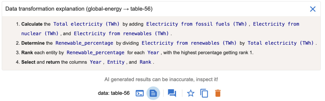
Figure 9: Df2 provides explanations of the code generated by AI to assist users understand the data transformation. This example is the explanation of the code behind table-56 in Figure 8.
图 9: Df2 提供了 AI 生成代码的解释,以帮助用户理解数据转换。此示例是图 8 中 table-56 背后代码的解释。
Benefiting from the decoupled chart specification and data transformation processes, when users want to update visualization styles (e.g., change color scheme, change sort order of an axis, or swap encodings) that do not require additional data transformation, they can directly perform edits in the chart builder. By updating channel properties or swapping encoded fields, these updates are directly reflected in the Vega-Lite script and rendered in the main panel. Unlike interactions with AI, which may have a slightly delayed response time, this approach allows users to achieve quick and precise edits with immediate visual feedback to refine the design.
得益于解耦的图表规范和数据转换过程,当用户希望更新可视化样式(例如,更改配色方案、更改轴的排序顺序或交换编码)而不需要额外的数据转换时,他们可以直接在图表构建器中进行编辑。通过更新通道属性或交换编码字段,这些更新会直接反映在 Vega-Lite 脚本中,并在主面板中呈现。与 AI 交互相比,这种方法允许用户实现快速且精确的编辑,并立即获得视觉反馈以优化设计。
3.4 Implementation
3.4 实现
Df2 is a React application with a python server for data transformation. Df2 has been tested with OpenAI models including GPT-3.5- turbo, GPT-4, GPT-4o, and GPT-4o-mini. We used GPT-3.5-turbo in our user study, and all but GPT-4 can generally response within 10 seconds. Df2 can sometimes be slow due to Vega-Lite rendering overhead (e.g., large datasets with more than 20,000 rows, long data threads with more than 20 charts). We envision that on-demand re-rendering of charts can improve its performance.
Df2 是一个使用 Python 语言服务器进行数据转换的 React 应用程序。Df2 已经过 OpenAI 模型的测试,包括 GPT-3.5-turbo、GPT-4、GPT-4o 和 GPT-4o-mini。在我们的用户研究中,我们使用了 GPT-3.5-turbo,除了 GPT-4 之外,其他模型通常可以在 10 秒内响应。由于 Vega-Lite 渲染的开销(例如,超过 20,000 行的数据集或超过 20 个图表的长数据线程),Df2 有时可能会变慢。我们设想按需重新渲染图表可以提高其性能。
4 User Study Design
4 用户研究设计
To understand potential benefits and usability issues of Df2, as well as users’ interaction styles, we designed a user study that asks participants to reproduce exploratory data analysis sessions involving iterative ly creating visualization s.
为了理解 Df2 的潜在优势和可用性问题,以及用户的交互方式,我们设计了一项用户研究,要求参与者重现涉及迭代创建可视化的探索性数据分析会话。
Figure 10: Participants’ self-reported roles, expertise in chart creation, data transformation, programming, and AI assistants ( ${\bf1}=$ novice, $\scriptstyle4=\epsilon$ expert), task completion time, and hints needed during study tasks.
图 10: 参与者自我报告的角色、图表创建、数据转换、编程和 AI 助手方面的专业知识 ( ${\bf1}=$ 新手, $\scriptstyle4=\epsilon$ 专家), 任务完成时间, 以及研究任务中所需的提示。
| ID | 角色 | 图表 | 数据 | 编程 | AI | 数据集1 | 数据集2 | 提示 |
|---|---|---|---|---|---|---|---|---|
| P1 | 开发者 | 3 | 4 | 4 | 2 | 1047s | 1666s | 1 |
| P2 | 数据科学家 | 3 | 4 | 4 | 4 | 1636s | 1886s | 0 |
| P3 | 数据架构师 | 3 | 4 | 4 | 4 | 715s | 2207s | 0 |
| P4 | 开发者 | 1 | 2 | 3 | 2 | 1036s | 1521s | 1 |
| P5 | 开发者 | 2 | 2 | 3 | 1 | 1251s | 2937s | 1 |
| P6 | 数据科学家 | 2 | 4 | 2 | 3 | 856s | 1148s | 3 |
| P7 | 数据科学家 | 3 | 4 | 3 | 3 | 1638s | 2372s | 1 |
| P8 | 开发者 | 3 | 3 | 4 | 1 | 1043s | 1987s | 2 |
Participants. After piloting and refining the study design with three volunteers, we recruited eight participants from a large company. Participants self-rated their skills (Figure 10) on a scale of 1 to 4 (“Novice,” “Intermediate,” “Proficient,” and “Expert”) in: (1) chart creation – experience with chart authoring tools or libraries, (2) data transformation – experience with data transformation tools and library expertise, (3) programming, and (4) AI assistants – experience with large language models (e.g., ChatGPT [1]) and prompting.
参与者。在与三位志愿者进行试点并完善研究设计后,我们从一家大公司招募了八名参与者。参与者自评了他们在以下方面的技能(图 10),评分范围为 1 到 4(“新手”、“中级”、“熟练”和“专家”):(1) 图表创建——使用图表制作工具或库的经验,(2) 数据转换——使用数据转换工具和库的专业知识,(3) 编程,以及 (4) AI 助手——使用大语言模型(例如 ChatGPT [1])和提示的经验。
Setup and procedure. Each study session, conducted remotely with screen sharing, consisted of four sections within a 2-hour slot. After introduction, participants followed step-by-step instructions in the tutorial slides ${\bf\tilde{\rho}}_{\sim25}$ minutes). Participants then completed a practice task with the option to ask questions ( ${\sim}15$ minutes) to test their understanding. Next, participants completed two study tasks, with only clarification questions allowed – we recorded hints they requested. The two study tasks involved creating 16 visualization s, 12 requiring data transformation. Participants were encouraged to think aloud. We concluded with a debriefing to (1) compare participants’ Df2 experiences with other tools, (2) understand their strategies using $\mathrm{D}\mathrm{\mathbf{F}}2$ , and (3) gather impressions and suggestions for improvements. Breaks between phases were encouraged.
设置与流程。每次研究会话通过远程屏幕共享进行,时长为2小时,包含四个部分。介绍环节后,参与者按照教程幻灯片中的步骤指示操作(约25分钟)。随后,参与者完成一个练习任务,期间可提问(约15分钟),以检验他们的理解。接着,参与者完成两项研究任务,仅允许澄清问题——我们记录了他们的提示请求。这两项任务涉及创建16个可视化,其中12个需要数据转换。鼓励参与者边做边思考。最后进行总结,目的是:(1) 比较参与者使用Df2与其他工具的经验,(2) 了解他们使用DF2的策略,以及(3) 收集印象和改进建议。鼓励各阶段之间休息。
Tutorial and practice tasks. We used the global energy dataset (described in Section 2) for the tutorial and practice tasks. In the tutorial, participants followed detailed instructions to recreate the six visualization s from Figure 2 (all but chart $\Theta$ ). In addition, participants also learned to inspect results and work with the AI’s mistakes. In the practice tasks, participants were asked to do similar analyses but focusing on the electricity from nuclear power, they were further asked to create a bar chart to visualize the difference of energy produced from nuclear power between 2000 and 2020 for each country.
教程和实践任务。我们使用全球能源数据集(在第2节中描述)进行教程和实践任务。在教程中,参与者按照详细说明重新创建了图2中的六个可视化(除了图表 $\Theta$)。此外,参与者还学习了如何检查结果并处理AI的错误。在实践任务中,参与者被要求进行类似的分析,但重点是核电发电量,他们还被要求创建一个条形图,以可视化每个国家在2000年和2020年之间核电发电量的差异。
Study tasks. To focus on participants’ iterative chart creation processes, rather than their ability to create a single chart or derive insights from exploration, we used an exploration session reproduction approach. Participants were asked to reproduce two data exploration sessions conducted by an experienced data scientist. We wanted to see if participants could iterative ly create charts with Df2, without requiring them to come up with exploration objectives on the fly (otherwise we would limit our participants to highly skilled data scientists). We used two exploration sessions from David Robinson’s live stream analysis of Tidy Tuesday datasets.
研究任务。为了关注参与者的迭代图表创建过程,而不是他们创建单个图表或从探索中得出见解的能力,我们采用了探索会话再现方法。参与者被要求再现由一位经验丰富的数据科学家进行的两次数据探索会话。我们想看看参与者是否能够使用 Df2 迭代创建图表,而不需要他们当场提出探索目标(否则我们将限制参与者为高技能的数据科学家)。我们使用了 David Robinson 对 Tidy Tuesday 数据集的直播分析中的两次探索会话。
Figure 11- $\bullet$ shows the first data exploration session: given a dataset on college majors and income data $(173~\mathrm{rows}\times7\$ columns), participants were asked to create seven visualization s: two basic charts and five requiring data transformation. These visualization s progressively explored the top-earning majors and the relationship between gender ratio and major salary. The process required participants to derive new fields (e.g., gender ratio), filter data (e.g., top 20 earning majors), derive new data (e.g., derive top earning major categories), and perform conditional formatting (e.g., color by top 4 categories and "others"). We provided a task description and reference chart (like chart reproduction studies in [44, 46]) for all but the last two visualization s. Without reference charts for the final two, we asked participants to verify correctness, probing their verification strategies. We did not provide iteration directions, letting participants develop iteration techniques.
图 11: $\bullet$ 展示了第一次数据探索会话:给定一个关于大学专业和收入的数据集 $(173~\mathrm{行}\times7\$ 列),参与者被要求创建七个可视化:两个基本图表和五个需要数据转换的图表。这些可视化逐步探索了收入最高的专业以及性别比例与专业薪资之间的关系。该过程要求参与者派生新字段(例如,性别比例)、过滤数据(例如,收入最高的20个专业)、派生新数据(例如,派生收入最高的专业类别)并执行条件格式设置(例如,按前4个类别和“其他”着色)。我们为除最后两个可视化之外的所有可视化提供了任务描述和参考图表(如[44, 46]中的图表再现研究)。对于最后两个可视化,我们没有提供参考图表,而是要求参与者验证正确性,探究他们的验证策略。我们没有提供迭代方向,让参与者自行开发迭代技术。
Figure 11- ⑥ shows the second data exploration session: given a movie dataset with budget and gross information (3281 rows $\times$ 8 columns), participants created nine visualization s. These visualizations explored movies and genres with the highest return on investment, comparing profit and profit ratios. Besides two basic box plots showing budget and worldwide gross distribution, the other seven charts required data transformation, including calculation and aggregation (average profit and profit ratio for each genre), string processing (extract year for trends), filtering (year $>2000$ ), and partitioning and ranking (top 20 movies for each metric). We hid references for the final two charts to probe participants’ verification process. In the following, we use “chart $\mathbf{\mathcal{\mathrm{C}}}k^{\mathbf{\mathrm{*}}}$ and “chart-M𝑘” to refer to the $k$ -th target charts in Figure 11 for the college and movies datasets, respectively.
图 11-⑥ 展示了第二次数据探索会话:给定一个包含预算和票房信息的电影数据集(3281 行 $\times$ 8 列),参与者创建了九个可视化图表。这些可视化图表探索了投资回报率最高的电影和类型,比较了利润和利润率。除了两个显示预算和全球票房分布的基本箱线图外,其他七个图表需要进行数据转换,包括计算和聚合(每个类型的平均利润和利润率)、字符串处理(提取年份以分析趋势)、过滤(年份 $>2000$ )、以及分区和排名(每个指标的前 20 部电影)。我们隐藏了最后两个图表的参考信息,以探究参与者的验证过程。在下文中,我们使用“图表 $\mathbf{\mathcal{\mathrm{C}}}k^{\mathbf{\mathrm{*}}}$ ”和“图表-M𝑘”分别指代图 11 中针对大学和电影数据集的第 $k$ 个目标图表。
5 User Study Results
5 用户研究结果
Here we report user study findings including users’ task completion statistics as well as their prompting, iteration and verification styles. We highlight user quotes and example prompts in this section.
我们在此报告用户研究结果,包括用户的任务完成统计数据,以及他们的提示、迭代和验证方式。本节中我们重点展示了用户的引述和示例提示。
Task completion. All participants successfully completed all 16 visualization s (Figure 10): participants took less than 20 mins on average to finish the seven charts in task 1, and about 33 mins for the nine charts in task 2. Since we let participants deviate from the main exploration task (e.g., in task 2, P4 asked to sort the bar chart for top profitable movies even though it was not required), the recorded completion time is an overestimate of the actual task time. During the study, six participants asked for hints to get unstuck during tasks; we categorize them as follows:
任务完成情况。所有参与者都成功完成了所有16个可视化任务(图10):参与者在任务1中平均花费不到20分钟完成7个图表,在任务2中完成9个图表大约花费33分钟。由于我们允许参与者偏离主要探索任务(例如,在任务2中,P4要求对最赚钱电影的条形图进行排序,尽管这不是必需的),因此记录的完成时间是对实际任务时间的高估。在研究过程中,有六名参与者在任务中请求提示以摆脱困境;我们将这些情况分类如下:
• Task clarification: P1 didn’t realize that top movies were restricted to movies after 2000; P4 and P6 required hints about the difference between profit and profit ratio in task 2; P6 asked about whether the $x$ -axis should be Year or Date for movie profit trends. • Data clarification: P6 an P8 were prompted to notice the difference between fields Major and Major Category in task 1. System performance: P5 encountered a performance issue when they created large sized charts. Tn task 2, P5 created multiple bar charts with Movie mapped to the $x$ -axis, resulting in bar charts containing 1300 categorical values. They were advised to reset the exploration session and resume tasks. • Chart encoding: P7 and P8 required hints on “why the chart didn’t render color legends” when they didn’t put a field in the color encoding; they expected to specify it only in NL input but not in the concept encoding shelf.
• 任务澄清:P1 没有意识到“顶级电影”仅限于2000年以后的电影;P4 和 P6 在任务2中需要提示关于利润和利润率之间的区别;P6 询问电影利润趋势的 $x$ 轴应该是“年份”还是“日期”。
• 数据澄清:P6 和 P8 在任务1中被提示注意“专业”和“专业类别”字段之间的区别。
• 系统性能:P5 在创建大型图表时遇到了性能问题。在任务2中,P5 创建了多个条形图,将“电影”映射到 $x$ 轴,导致条形图包含1300个分类值。他们被建议重置探索会话并重新开始任务。
• 图表编码:P7 和 P8 在未将字段放入颜色编码时需要提示“为什么图表没有渲染颜色图例”;他们期望仅在自然语言输入中指定,而不是在概念编码栏中指定。
During the debriefing, participants commented that these tasks would be much more difficult to complete with tools they are familiar with. P1, a programming expert, mentioned that they were “obviously much faster” with Df2 as it helped with data transformations. When asked about their experience comparing against chat-based AI assistants, participants noted (1) the iteration support makes it easier to create more charts and (2) the $\mathrm{UI}+\mathrm{NL}$ approach in Df2 is more effective for communicating intent structurally. For example, P2 mentioned “with ChatGPT, I would have to put a bit more effort to specify the instructions to get what I want, iterations here is much faster with UI.” P4 mentioned that “with ChatGPT, you need to give much more context, I need to describe in detail about what x,y-axes should be, but here I can just provide with UI,” and further commented that $\mathrm{UI}+\mathrm{NI}$ “helped me in framing and structuring the different transformations that we need to do to get to that end result.”
在汇报过程中,参与者评论说,使用他们熟悉的工具完成这些任务会更加困难。P1 是一位编程专家,提到使用 Df2 时“明显快得多”,因为它帮助完成了数据转换。当被问及与基于聊天的 AI 助手相比的体验时,参与者指出:(1) 迭代支持使得创建更多图表更加容易;(2) Df2 中的 $\mathrm{UI}+\mathrm{NL}$ 方法在结构化传达意图方面更为有效。例如,P2 提到“使用 ChatGPT 时,我需要花更多精力来指定指令以得到我想要的结果,而在这里使用 UI 进行迭代要快得多。”P4 提到“使用 ChatGPT 时,你需要提供更多的上下文,我需要详细描述 x、y 轴应该是什么,但在这里我可以通过 UI 直接提供”,并进一步评论说 $\mathrm{UI}+\mathrm{NI}$ “帮助我构建和结构化我们需要进行的各种转换,以达到最终结果。”
Iteration styles. Participants developed their own iteration styles working with $\mathrm{D}\mathrm{_ {F}}2$ –Figure 12 illustrates their organization of data threads in their workspaces upon completing the study tasks. Although our participant pool of 8 did not encompass all possible users’ data exploration styles with $\mathrm{D}\mathrm{_{F}}2$ , we observed surprising behavior clusters and distinct approach differences. We characterize participants’ iteration styles based on their preferences between “wider” versus “deeper” tree structures, “backtrack and revise” versus “follow up” for providing new instructions to the AI, as well as their preferences for including intermediate tables in their threads.
迭代风格。参与者在使用 $\mathrm{D}\mathrm{_ {F}}2$ 时发展出了自己的迭代风格——图 12 展示了他们在完成研究任务后工作空间中数据线程的组织方式。尽管我们的 8 名参与者并未涵盖所有可能的用户在使用 $\mathrm{D}\mathrm{_{F}}2$ 时的数据探索风格,但我们观察到了令人惊讶的行为集群和显著的方法差异。我们根据参与者在“更宽”与“更深”的树结构之间的偏好、在“回溯和修订”与“跟进”之间为 AI 提供新指令的偏好,以及他们在线程中包含中间表格的偏好,来刻画他们的迭代风格。
(Wide versus deep tree organizations): From the high-level organization of data threads, one group of participants (P1, P3, P5, P7, P8) preferred to branch out more often with shorter data threads than the other group (P2, P4, P6), who preferred to create fewer but longer data threads instead. P1 explained that their preference of more branches with shorter data threads came from their coding style of “creating as many as transformation as I can from one single table without generating derived tables” to keep the system’s memory usage minimal and keep the workspace “terse.” On the other hand, P2, who preferred longer data threads, mentioned “I definitely like to be able to just work on top of that and like going forward by just giving a new prompt, because it remembers the context prior to the last one. It ends up generating the right data and visualization.” P2 further commented that “going back created too much branching” and they preferred to use longer threads to just provide updates for “smooth train of thoughts.” To effectively work with long threads, P4 organized their exploration process thoughtfully, as they were “using the prompts as my anchor, so, when I wanted to figure out where I wanted to go, it was the prompts that I was looking for.”
(Wide versus deep tree organizations): 从数据线程的高层组织来看,一组参与者 (P1, P3, P5, P7, P8) 更倾向于频繁分支并创建较短的数据线程,而另一组参与者 (P2, P4, P6) 则更倾向于创建较少但较长的数据线程。P1 解释说,他们之所以偏好更多分支和较短的数据线程,是因为他们的编码风格是“尽可能从一个表中创建尽可能多的转换,而不生成派生表”,以保持系统内存使用的最小化并使工作空间“简洁”。另一方面,P2 更喜欢较长的数据线程,他提到“我肯定希望能够在此基础上继续工作,并通过提供一个新的提示来推进,因为它记住了之前的上下文。最终它生成了正确的数据和可视化。” P2 进一步评论说,“回退操作会导致太多分支”,他更喜欢使用较长的线程来提供更新,以保持“思维的流畅性”。为了有效地处理长线程,P4 深思熟虑地组织了他们的探索过程,因为他们“使用提示作为我的锚点,所以当我想弄清楚我要去哪里时,我会寻找这些提示。”

Figure 11: The dataset and tasks in our user study. (1) Dataset 1: Understanding top earning majors and the relation between salary and women percentage. (2) Dataset 2: Exploring movie genres with best return-on-investment values (profit vs. profit ratio) and top movies. The branching directions are added for illustration; participants developed their own iteration strategies. We refer to these target charts as C1-7 for the college dataset and M1-9 for the movies dataset.
图 11: 我们用户研究中的数据集和任务。(1) 数据集 1: 了解高收入专业以及薪资与女性比例之间的关系。(2) 数据集 2: 探索具有最佳投资回报率(利润与利润率)的电影类型和顶级电影。分支方向仅为示意;参与者开发了自己的迭代策略。我们将这些目标图表分别称为 C1-7(大学数据集)和 M1-9(电影数据集)。
(Backtracking versus following-up): We observed interesting patterns in participants’ preferences when creating new charts or correcting unexpected results: some preferred revising previous instructions (evident from workflows with more self-loop arrows), while others favored following up (characterized by more forward arrows and intermediate gray data nodes). The first group, represented by P1, P2 and P3, preferred to go back and re-issue prompts, either to enrich the previous data to support multiple target visualization s (indicated by yellow nodes with multiple target charts), or to update the data to correct unexpected results. For example, when P1 and P3 worked on coloring the top 20 earning majors with their major categories (chart-C4 in Figure 11), they revised the previous prompt (“show only top 20 majors based on median salary” $\rightarrow$ “show only top 20 majors based on median salary, include major category” by P1) to include Major Category so that both old and the new charts can be created from the same data. To correct a mistake they made in creating chart-M7 (they forgot to instruct the AI to show only top 20 movies), P3 chose to go back and revise their previous prompt (“calculate the profit ratio per movie (worldwide gross/budget) after 2000” $\rightarrow$ “calculate the profit ratio per movie (worldwide gross/budget) after 2000 and display the top 20 higher profit ratio movies”). P1 commented that “I don’t like to pollute my workspace” and “I like to keep my workspace as clean as possible.” P3 mentioned that their preference of revision came from the concept of building a “global expanded dataset” so that “[when I] need to calculate the new thing or see a new visual I can come back to the new expanded data set.”
回溯与跟进:我们观察到参与者在创建新图表或纠正意外结果时的偏好模式:有些人倾向于修改之前的指令(从带有更多自循环箭头的工作流中可以看出),而另一些人则更喜欢跟进(表现为更多的前向箭头和中间的灰色数据节点)。第一组以 P1、P2 和 P3 为代表,他们倾向于回溯并重新发出提示,要么是为了丰富之前的数据以支持多个目标可视化(由带有多个目标图表的黄色节点表示),要么是为了更新数据以纠正意外结果。例如,当 P1 和 P3 在处理用专业类别为收入最高的 20 个专业着色时(图 11 中的 chart-C4),他们修改了之前的提示(“仅显示基于中位数工资的前 20 个专业” $\rightarrow$ “仅显示基于中位数工资的前 20 个专业,包括专业类别” by P1),以包含专业类别,从而可以从相同的数据中创建旧的和新的图表。为了纠正他们在创建 chart-M7 时犯的错误(他们忘记指示 AI 仅显示前 20 部电影),P3 选择回溯并修改之前的提示(“计算 2000 年后每部电影的利润比率(全球票房/预算)” $\rightarrow$ “计算 2000 年后每部电影的利润比率(全球票房/预算)并显示利润比率最高的前 20 部电影”)。P1 评论说:“我不喜欢污染我的工作空间”以及“我喜欢尽可能保持工作空间整洁。” P3 提到,他们倾向于修改是因为构建“全局扩展数据集”的概念,这样“[当我]需要计算新内容或查看新可视化时,我可以回到新的扩展数据集。”

Figure 12: Participants’ workflow for study tasks in Figure 11 (C1-7 for college, M1-9 for movie). Each node represents a data table version, with blue for initial datasets, yellow for data tables instant i a ting (one or multiple) target visualization s in Figure 11 (number 𝑖 in the node indicate the $i$ -th target visualization s for the given dataset), and gray for others. Self-loop arrows indicate prompt revisions and data table updates ( $^{\bullet}\times{2}^{,}$ indicates two revisions).
图 12: 图 11 中研究任务的参与者工作流程(C1-7 为大学数据,M1-9 为电影数据)。每个节点代表一个数据表版本,蓝色表示初始数据集,黄色表示数据表实例化图 11 中的一个或多个目标可视化(节点中的数字 𝑖 表示给定数据集的第 $i$ 个目标可视化),灰色表示其他情况。自循环箭头表示提示修订和数据表更新($^{\bullet}\times{2}^{,}$ 表示两次修订)。
On the other hand, another group, represented by P4, P5, P6, and P7, preferred not only to issue follow-up instructions for new charts but also to provide updates with very brief instructions at each step, creating many intermediate nodes along the way (gray nodes in Figure 12). For example, P5 created chart-M7 (top movies with highest profit ratio colored by genre) in five steps: “filter movies after year $2000^{,}\rightarrow~^{\leftarrow}s h o w$ top 5 highest profit ratio” $\rightarrow$ “bring back movie” (i.e., the Movie field) $\rightarrow$ “show top $10^{"}\rightarrow$ “calculate profit ratio,” creating four intermediate nodes. P5 noted that “probably redoing would make sense, but if I can think that I can build on top of that, there is no value for me to go back and start from that, [which] kind of nullify these things [I have done],” as they preferred to keep their work around. P6 mentioned that they adapt their iteration style based on the type of mistakes they encountered: “if it is something intermediate where I’ve made the mistake, I’ll go [create a new instruction] and fix the previous step” but when it “is a totally new kind of visualization I have in my mind” or “if it is something I missed altogether, I will just cancel the whole thing and start from scratch.”
另一方面,以 P4、P5、P6 和 P7 为代表的另一组用户不仅倾向于为新图表发布后续指令,还喜欢在每一步提供非常简短的更新指令,从而在过程中创建了许多中间节点(图 12 中的灰色节点)。例如,P5 通过五个步骤创建了图表-M7(按类型着色的最高利润率电影):“过滤 2000 年以后的电影 $\rightarrow$ 显示前 5 个最高利润率” $\rightarrow$ “带回电影”(即电影字段) $\rightarrow$ “显示前 10 个” $\rightarrow$ “计算利润率”,创建了四个中间节点。P5 指出:“可能重做是有意义的,但如果我认为可以在现有基础上继续构建,那么对我来说就没有必要回去重新开始,[这] 某种程度上否定了我之前的努力”,因为他们更倾向于保留自己的工作。P6 提到,他们会根据遇到的错误类型调整迭代方式:“如果是在中间步骤犯了错误,我会[创建新指令]并修复前一步”,但当“是我脑海中全新的可视化类型”或“如果我完全遗漏了某些内容,我会直接取消整个操作并从头开始。”
(Choices of data to iterate on): Participants had different strategies deciding which previous data/charts to use to create new charts. P1 chose to derive the new chart from a previous chart that shares similar visual design. For example, P1 created chart-M9 from M7 since they are both bar charts showing top ranked movies, despite one is based on profit while another is based on profit ratio. In a different fashion, P2, P4 and P5 often branch out based on similarity of computations used. For example, P2 created chart-M7 about movies with highest profit ratio based on chart-M6 showing profit ratio trends for each genre over time, as they shared the same computation “profit ratio.” P2 explained their data-centric approach was because they “prefer to have more control over the data as opposed to the chart later on.” They also appreciated that Df2 “sort of brings together both data-centric and chart-centric people.”
(数据迭代的选择):参与者在决定使用哪些之前的数据/图表来创建新图表时,采用了不同的策略。P1 选择从具有相似视觉设计的先前图表中派生新图表。例如,P1 从 M7 创建了图表 M9,因为它们都是显示排名靠前电影的条形图,尽管一个基于利润,另一个基于利润率。与此不同,P2、P4 和 P5 经常基于所使用的计算的相似性进行分支。例如,P2 基于显示每种类型电影利润率随时间变化的图表 M6 创建了关于利润率最高电影的图表 M7,因为它们共享相同的计算“利润率”。P2 解释说,他们以数据为中心的方法是因为他们“更喜欢在数据上拥有更多控制权,而不是在图表上”。他们还赞赏 Df2“在某种程度上将数据为中心和图表为中心的人结合在一起”。
Prompt styles. Prompts created by participants are all short (less than 20 words). We observed that participants created diverse styles of prompts, both in terms of how they phrase the instruction (e.g., question, command) and the subject they asked (e.g., describing expected visual output or output data property, providing computation formula). The most common style of prompts is imperative commands, that either describe the transformation to be conducted or the property of the desired output. For example, to filter top earning movies, participants used prompts “show only top $20^{\mathrm{}\mathrm{}\mathrm{}\mathrm{}}$ [P6] and“filter top 10 movies based on median profit” [P5]. Participants also used command-style prompts for describing computations (e.g., “calculate ratio of worldwide gross by production budget” [P5]) and for visual updates (e.g., “color by major category” [P8]. We also observed that some participants prompted with questions (e.g., “can you show only the top 5 countries in terms of increases?” [P7]), or prompted in a chat style (e.g., “Good. We need to now find the Median profit ratio each year for each genre” [P2].
提示风格。参与者创建的提示都很简短(少于20个词)。我们观察到,参与者在提示的措辞方式(例如,问题、命令)和所问的主题(例如,描述预期的视觉输出或输出数据属性,提供计算公式)方面都创造了多样化的风格。最常见的提示风格是命令式指令,这些指令要么描述要进行的转换,要么描述期望输出的属性。例如,为了筛选收入最高的电影,参与者使用了提示“仅显示前20名” [P6] 和“根据中位数利润筛选前10部电影” [P5]。参与者还使用命令式提示来描述计算(例如,“计算全球票房与制作预算的比率” [P5])和视觉更新(例如,“按主要类别着色” [P8])。我们还观察到,一些参与者以问题形式提示(例如,“你能只显示前5个增长最快的国家吗?” [P7]),或以聊天风格提示(例如,“很好。我们现在需要找到每年每种类型的中位数利润率” [P2])。
One participant, P5, had a distinct prompting style, that directly asked the AI to add, mutate, or retrieve columns on top of the previous data. For example, P5 asked “bring back major category” to create chart-C4 from C3, “divide by $100,000^{\ '}$ for updating profit units, “bring back release date” before they used a follow-up command “show only year greater than $2,000^{,,}$ to filter movies by date. P7 preferred to use more verbose prompts to reiterate the computation they intended to achieve whenever they mentioned the concept. For example, to ensure that the AI would not interpret the computation differently, they copy/pasted the formula to the prompt whenever they mentioned profit ratio — “median profit ratio (worldwide gross/production budget) by year and by genre.” P6, on the other hand, preferred to use no additional prompts and provided more descriptive field names. For example, to create chartC5, they mapped “percentage of women of Total Men and Women” to $x$ -axis, Median Salary to $y$ , and provided no prompt in the input box. In fact, we observed that Df2 can reliably transform data with selfexplanatory field names (e.g., “renewable energy percentage”, “women percentage”, and “difference between 2020 and $2000^{\mathfrak{s}}$ ) without any additional prompts. Some participants’ preference for using shorter names and additional (short) prompts was “to minimize the error space [for AI]” [P7].
一位参与者 P5 有一种独特的提示风格,直接要求 AI 在之前的数据基础上添加、修改或检索列。例如,P5 要求“带回主要类别”以从 C3 创建图表 C4,“除以 $100,000^{\ '}$”以更新利润单位,“带回发布日期”后,他们使用了一个后续命令“仅显示年份大于 $2,000^{,,}$”以按日期过滤电影。P7 更喜欢使用更详细的提示来重申他们每次提到概念时想要实现的计算。例如,为了确保 AI 不会以不同的方式解释计算,他们每次提到利润率时都会将公式复制/粘贴到提示中——“按年份和类型的中位利润率(全球总收入/制作预算)”。另一方面,P6 更喜欢不使用额外的提示,并提供更具描述性的字段名称。例如,为了创建图表 C5,他们将“女性占总男性和女性的百分比”映射到 $x$ 轴,将中位工资映射到 $y$ 轴,并且在输入框中没有提供任何提示。事实上,我们观察到 Df2 可以可靠地转换具有自解释字段名称的数据(例如,“可再生能源百分比”、“女性百分比”和“2020 年与 $2000^{\mathfrak{s}}$ 之间的差异”),而无需任何额外的提示。一些参与者更喜欢使用较短的名称和额外的(简短)提示,目的是“最小化 [AI 的] 错误空间”[P7]。
Verification. To proceed through iterative exploration, or repeat/- correct a step, participants needed to understand the chart and verify that the transformation was performed correctly. Most of the time, participants spotted unintended output easily through incorrect patterns in rendered visualization s. This happened especially when there were differences in visual encoding (e.g., when P5 incorrectly mapped release date to the $x$ -axis instead of year on chartM5), cardinality (e.g., when P6 incorrectly asked the AI to color the bars by major instead of major category for chart-C6), or high-level patterns (e.g., when P7 requested women versus median salary for chart-C7, leading to results based on the count of women instead of the percentage). When the transformation is straightforward, participants visually inspected the chart and data to verify correctness. For example, after P3 asked “filter the year after $2000^{\mathfrak{s}}$ to show only profit ratio trends for movies after 2000 (chart-M8), they checked the $x$ -axis domain and compared the generated chart with the pre-filtered one. Similarly, after P2 input “filter results to top $20~b y$ major” to find the highest earning majors (chart-C5), they referred to the previous chart with all of the majors’ median salary sorted to check filtering correctness.
验证。为了通过迭代探索继续前进,或重复/纠正某个步骤,参与者需要理解图表并验证转换是否正确执行。大多数时候,参与者通过渲染的可视化中的错误模式轻松发现意外的输出。这种情况尤其发生在视觉编码(例如,当P5错误地将发布日期映射到$x$轴而不是年份时,如图表M5所示)、基数(例如,当P6错误地要求AI按专业而不是专业类别为图表C6着色时)或高级模式(例如,当P7要求显示女性与中位数工资的对比时,如图表C7所示,导致结果基于女性数量而不是百分比)存在差异时。当转换简单时,参与者会通过视觉检查图表和数据来验证正确性。例如,在P3要求“过滤2000年以后的年份以仅显示2000年以后的电影利润率趋势”(图表M8)后,他们检查了$x$轴的范围,并将生成的图表与过滤前的图表进行了比较。同样,在P2输入“过滤结果以显示前20个专业”以找到收入最高的专业(图表C5)后,他们参考了之前按所有专业中位数工资排序的图表来检查过滤的正确性。
To check whether unobvious computations were done correctly (e.g., whether the LLM computed profit ratio correctly), different participants’ background impacted how they validated the results: participants either referred to (1) explanations of the code, (2) the actual code (even if they are non-python programmers), or (3) values in the result table to check correctness. P3 mentioned “as an expert, I like to see the prompt to the model, and then the code generated;
为了检查不明显计算是否正确完成(例如,大语言模型是否正确计算了利润率),不同参与者的背景影响了他们验证结果的方式:参与者要么参考(1)代码的解释,(2)实际代码(即使他们不是Python语言程序员),要么(3)结果表中的值来检查正确性。P3提到:“作为专家,我喜欢看到模型的提示,然后生成的代码;
but as a business user, I would imagine using more data, chart, and explanations.” while P4 commented “[explanation] steps were really, really helpful in terms of figuring out whether it is doing the right thing as to what I’m asking it to do. That and also the data chart underneath.” P7 noted that, for trust, the definition of a new field is more crucial than the actual code: “I just want to make sure that definition, like profit ratio, when I check in, I only look at those definitions if they are correct. I’m less worried about the real coding piece.” Thus, they use code explanations frequently to check definitions. Meanwhile, P7 stated that they felt some pressure from the study environment not to spend too much time understanding code for which they were not familiar with, but they would trust code more. We also observed participants who developed trust in a workflow (by examining code and data tables) when it was straightforward, and then, they assumed the more complicated transformations built on top of these steps worked.
但作为业务用户,我会想象使用更多的数据、图表和解释。”而 P4 评论道:“[解释]步骤在弄清楚它是否按照我的要求做正确的事情方面非常非常有帮助。还有下面的数据图表。” P7 指出,对于信任而言,新字段的定义比实际代码更为关键:“我只想确保定义,比如利润率,当我检查时,我只查看这些定义是否正确。我对实际的代码部分不太担心。”因此,他们经常使用代码解释来检查定义。与此同时,P7 表示,他们感受到研究环境的压力,不要花太多时间去理解他们不熟悉的代码,但他们会更信任代码。我们还观察到,当工作流程简单时,参与者会通过检查代码和数据表来建立信任,然后他们会假设基于这些步骤的更复杂的转换是有效的。
Additional Feedback. Several users noted potential improvements of Df2. P1 commented on how small interface variations might give different afford ances. For instance, “if there was a large view for data threads, it would encourage me to do more transformations and do more branching.” P3 mentioned that they prefer the AI to ask the user to disambiguate when the intent is unclear rather than trying to solve the task with unclear specification. P7 used instructions that were very detailed and sometimes incorrect, which in turn, made iteration more difficult, since it was difficult to increment ally modify these instructions. We discussed the potential of having templates or AI feedback for instruction crafting to reduce errors.
额外反馈。几位用户指出了 Df2 的潜在改进方向。P1 评论了界面微小变化可能带来的不同效果。例如,“如果数据线程有一个更大的视图,会鼓励我进行更多的转换和分支操作。” P3 提到,他们更希望 AI 在意图不明确时请求用户澄清,而不是试图在不明确的规范下解决问题。P7 使用了非常详细但有时不正确的指令,这使得迭代变得更加困难,因为这些指令难以逐步修改。我们讨论了使用模板或 AI 反馈来辅助指令编写以减少错误的可能性。
6 Discussion and Future Work
6 讨论与未来工作
Supporting recommendations in exploratory analysis. Df2 focuses on visualization authoring, where an AI completes tasks needed to achieve a user’s intended action. We envision that $\mathrm{D}\mathrm{_{F2}}$ can be enhanced with recommendation capabilities like Voyager [65], Draco [35], and Lux [25] for suggesting visualization goals to help users “cold start” their analysis. Df2’s designs can benefit user experiences with visualization recommendation tools in two ways. First, because Df2 supports visualization beyond initial data formats, it overcomes the limitation of most existing tools, which only consider fields in the input table for recommendation. Second, Df2’s data threads provide a natural way for users to follow up the system’s initial recommendations, either to dive deeper into an exploration direction, revising suggested charts, or to ask for different recommendations. To achieve this, we can add a recommendation component that can suggest a list of fields to be explored and let $\mathrm{D}\mathrm{F}2$ prepare data to surface the fields and create visualization s. The initial recommendation of the fields of interests can be generated either automatically from the analysis of input data characteristics or in a mixed-initiative approach, i.e., leveraging AI to generate them using a high-level natural language instruction provided by the user — these fields do not have to be fields in input data, as Df2 can transform the data to derive them from existing ones. While Df2’s data transformation ability can extend the visualization exploration space, thus bringing in more potential insights to be discovered, it also increases the chances of suggesting field combinations that are either trivial, distracting, or even biased. Therefore, as part of future work, it would be valuable to explore ways to support visual recommendation in a larger exploration space, especially managing and communicating exploration paths to the user to prevent unintentional bias towards an undesired direction.
支持探索性分析中的推荐功能。Df2 专注于可视化创作,其中 AI 完成实现用户预期操作所需的任务。我们设想 $\mathrm{D}\mathrm{_{F2}}$ 可以通过类似 Voyager [65]、Draco [35] 和 Lux [25] 的推荐功能进行增强,以建议可视化目标,帮助用户“冷启动”分析。Df2 的设计可以在两个方面改善用户在使用可视化推荐工具时的体验。首先,由于 Df2 支持超出初始数据格式的可视化,它克服了大多数现有工具的限制,这些工具仅考虑输入表中的字段进行推荐。其次,Df2 的数据线程为用户提供了一种自然的方式来跟进系统的初始推荐,无论是深入探索方向、修改建议的图表,还是请求不同的推荐。为了实现这一点,我们可以添加一个推荐组件,该组件可以建议要探索的字段列表,并让 $\mathrm{D}\mathrm{F}2$ 准备数据以展示这些字段并创建可视化。初始的感兴趣字段推荐可以通过自动分析输入数据特征生成,或者采用混合主动方法,即利用 AI 根据用户提供的高级自然语言指令生成这些字段 —— 这些字段不必是输入数据中的字段,因为 Df2 可以转换数据以从现有字段中派生它们。虽然 Df2 的数据转换能力可以扩展可视化探索空间,从而带来更多潜在的洞察,但它也增加了建议的字段组合可能是琐碎、分散甚至带有偏见的机会。因此,作为未来工作的一部分,探索在更大的探索空间中支持视觉推荐的方法将非常有价值,特别是管理和向用户传达探索路径,以防止无意中偏向不希望的方向。
Coordinating data transformation and chart editing. Df2 derives new data based on users’ inputs to instantiate the chart design, but it does not modify the chart itself (represented as a Vega-Lite specification). When the user wants to refine the chart design (e.g., updating color scheme or $x$ -axis ordering), they edit it through GUI widgets in the encoding panel after the chart is created. This design leverages the natural and precise nature of UI updates, providing immediate visual feedback [55]. It also utilizes current models’ strengths in data transformation for more reliable outputs [12, 24]. In contrast, current models perform less effectively in editing charts or generating charts from data based on NL instructions, even when the data is prepared [6]. Despite this, some participants in the user study showed interest in asking Df2 to perform chart edits within the chart builder alongside data transformation. A potential solution is an agent-based system [66, 71] that plans whether to transform data, edit the chart script, or both based on user inputs, and dispatches agents to handle these tasks. The key challenge is managing response time and maintaining reliability, as AI agents often require multiple interactions to reach consensus.
协调数据转换和图表编辑。Df2 根据用户的输入派生新数据以实例化图表设计,但它不会修改图表本身(表示为 Vega-Lite 规范)。当用户想要优化图表设计(例如,更新配色方案或 $x$ 轴排序)时,他们可以在图表创建后通过编码面板中的 GUI 小部件进行编辑。这种设计利用了 UI 更新的自然性和精确性,提供即时的视觉反馈 [55]。它还利用了当前模型在数据转换方面的优势,以提供更可靠的输出 [12, 24]。相比之下,当前模型在编辑图表或根据自然语言指令从数据生成图表方面表现较差,即使数据已经准备好 [6]。尽管如此,用户研究中的一些参与者表现出兴趣,希望 Df2 在图表构建器中同时执行图表编辑和数据转换。一个潜在的解决方案是基于智能体的系统 [66, 71],该系统根据用户输入计划是转换数据、编辑图表脚本,还是两者都做,并派遣智能体来处理这些任务。关键的挑战是管理响应时间并保持可靠性,因为 AI 智能体通常需要多次交互才能达成共识。
Asking users to clarify ambiguous inputs. Df2 adopts a generation verification approach: AI attempts to complete the user’s request, and the user inspects the result to provide follow-up instructions. This interaction loop is enhanced by Df2’s local data thread design. There is an opportunity to make AI more proactive, such as actively seeking clarification from users when their inputs are ambiguous, before attempting to solve the task. This could reduce users’ verification and revision efforts. For example, when the user issues an unclear request (e.g., “show top $5^{\circ}$ ), the system can first analyze the goal, and then either present a refined goal for confirmation (e.g., “do you mean top 5 by renewable percentage?”) or ask the users to clarify their intent (e.g., “what criteria should be used for ranking?”). This proactive approach could also promote users’ trust in the AI system. It is an interesting research direction to explore ways to prompt or train AI models to ask only necessary clarification questions, preventing users from being overwhelmed with low-level questions that might interrupt their workflow.
要求用户澄清模糊输入。Df2 采用生成验证方法:AI 尝试完成用户的请求,用户检查结果并提供后续指令。Df2 的本地数据线程设计增强了这种交互循环。有机会让 AI 更加主动,例如在尝试解决任务之前,当用户输入模糊时主动寻求用户的澄清。这可以减少用户的验证和修订工作。例如,当用户发出不明确的请求(例如,“显示前 $5^{\circ}$”),系统可以首先分析目标,然后要么呈现一个精炼的目标以供确认(例如,“你的意思是按可再生能源百分比的前 5 名吗?”),要么要求用户澄清他们的意图(例如,“应该使用什么标准进行排名?”)。这种主动方法还可以促进用户对 AI 系统的信任。探索如何提示或训练 AI 模型只提出必要的澄清问题,防止用户被可能中断工作流的低级问题淹没,是一个有趣的研究方向。
Study limitations. In our user study, we used the reproduction of professional data analysts’ exploration sessions as the study tasks, rather than asking participants to perform free explorations. This choice was made to minimize the impact of participants’ data analysis skills on their experience with $\mathrm{D}\mathrm{\mathbf{F}}2$ , as our goal was not to assess their exploration skills. A follow-up study, where participants perform open exploration with their own data, can further investigate how $\mathrm{D}\mathrm{\mathbf{F}}2$ can assist analysts with planning during exploration. In addition, as a limitation of our lab study, we could not capture users’ longer-term learning effects. A future longitudinal study could further investigate how users’ expectations with $\mathrm{D}\mathrm{_{F}}2$ change over time and how this affects their specification styles and iteration strategies.
研究局限性。在我们的用户研究中,我们使用了专业数据分析师的探索会话复现作为研究任务,而不是让参与者进行自由探索。这一选择是为了尽量减少参与者数据分析技能对他们使用 $\mathrm{D}\mathrm{\mathbf{F}}2$ 体验的影响,因为我们的目标不是评估他们的探索技能。后续研究可以让参与者使用自己的数据进行开放式探索,进一步研究 $\mathrm{D}\mathrm{\mathbf{F}}2$ 如何在探索过程中协助分析师进行规划。此外,由于实验室研究的局限性,我们无法捕捉用户的长期学习效果。未来的纵向研究可以进一步探讨用户对 $\mathrm{D}\mathrm{_{F}}2$ 的期望如何随时间变化,以及这如何影响他们的规范风格和迭代策略。
7 Related Work
7 相关工作
Compared to its predecessor, Data Formulator [58], Df2 has transitioned from a single-turn chart authoring tool into an iterative visualization tool designed for data exploration. Concretely, Data Formulator [58] is a single-turn authoring tool that leverages different authoring paradigms for various types of data transformations. It uses programming-by-example for table reshaping and employs LLMs to generate code for single column derivation. However, users may struggle with choosing the appropriate paradigm for the required transformations. Df2 unifies the interaction paradigms with a blended UI and natural language input design, supporting iterative authoring. This allows users to build new charts from previous ones with minimal additional specification. Df2’s new interaction approaches not only broaden the expressiveness of supported data transformations but also reduce the users’ specification overhead. We next illustrate related work on chart authoring, data transformation, and data exploration tools that inspired the design of $\mathrm{D}\mathrm{_{F}}2$ .
与其前身 Data Formulator [58] 相比,Df2 已经从单轮图表创作工具转变为专为数据探索设计的迭代可视化工具。具体来说,Data Formulator [58] 是一个单轮创作工具,它利用不同的创作范式来处理各种类型的数据转换。它通过示例编程来进行表格重塑,并使用大语言模型生成单列推导的代码。然而,用户可能难以选择适合所需转换的范式。Df2 通过混合用户界面和自然语言输入设计统一了交互范式,支持迭代创作。这使得用户能够以最少的额外规范从先前的图表中构建新图表。Df2 的新交互方法不仅拓宽了支持的数据转换的表达能力,还减少了用户的规范开销。接下来,我们将介绍启发 $\mathrm{D}\mathrm{_{F}}2$ 设计的图表创作、数据转换和数据探索工具的相关工作。
LLM-powered visualization tools. Large language models’ code generation ability [1, 5, 29, 54] motivates the designs of new AIpowered visualization s tools [11, 31, 53, 58] that allows users to create visualization using high-level natural language descriptions. For example, LIDA [10] can summarize data and use LLM to generate python code to generate visualization s. Because LLMs can struggle in understanding complex chart logic, ChartGPT [53] decomposes visualization tasks into fine-grained reasoning pipelines (e.g., column selection, filtering, chart type selection, visual encoding), using chain-of-thoughts prompting [59]. As single-turn interactive tools, they are not suitable for iterative analysis. For multi-turn interactions, users can directly chat with LLMs in Code Interpreter [1] or Chat2Vis [31]. Code Interpreter equips the LLM with a Python interpreter so that the model can generate and execute code to transform data and create charts; Chat2Vis includes visualization-specific prompts to help the model generate visualizations more reliably. Since these tools organize the dialog linearly, users need to put in extra effort to clarify the context when there are branches, to reduce the chances of models applying incorrect contexts and making mistakes in the new task [17, 26, 70].
LLM驱动的可视化工具。大语言模型的代码生成能力 [1, 5, 29, 54] 推动了新型AI驱动的可视化工具的设计 [11, 31, 53, 58],这些工具允许用户使用高级自然语言描述来创建可视化。例如,LIDA [10] 可以总结数据并使用大语言模型生成Python代码来生成可视化。由于大语言模型在理解复杂图表逻辑时可能存在困难,ChartGPT [53] 将可视化任务分解为细粒度的推理管道(例如,列选择、过滤、图表类型选择、视觉编码),并使用思维链提示 [59]。作为单轮交互工具,它们不适合迭代分析。对于多轮交互,用户可以直接在Code Interpreter [1] 或 Chat2Vis [31] 中与大语言模型进行对话。Code Interpreter 为大语言模型配备了Python解释器,使模型能够生成并执行代码以转换数据和创建图表;Chat2Vis 包含特定于可视化的提示,以帮助模型更可靠地生成可视化。由于这些工具以线性方式组织对话,当存在分支时,用户需要额外努力来澄清上下文,以减少模型在新任务中应用错误上下文和犯错误的机会 [17, 26, 70]。
Df2 is also an LLM-powered tool that shares similar prompt designs to LIDA and Chat2Vis (e.g., the use of data summaries) and supports NL interaction. The key difference is that Df2 blends UI and natural language inputs for chart specification, balancing precision and flexibility, rather than requiring users to describe everything in text. Df2’s data threads generalize linear contexts used in existing dialog systems, allowing users to control the iteration direction by providing authoring contexts to the AI model.
Df2 也是一款由大语言模型 (LLM) 驱动的工具,它与 LIDA 和 Chat2Vis 共享类似的提示设计(例如,使用数据摘要),并支持自然语言 (NL) 交互。关键区别在于,Df2 将用户界面 (UI) 和自然语言输入结合用于图表规范,平衡了精确性和灵活性,而不是要求用户用文本描述所有内容。Df2 的数据线程泛化了现有对话系统中使用的线性上下文,允许用户通过向 AI 模型提供创作上下文来控制迭代方向。
Other AI and synthesis-powered tools. Besides LLM-powered tools above, neural semantic parsing [7, 34, 36], and program synthesis-based tools [57] have also been developed to address the visualization challenge. For example, NL4DV [36] and NcNet [30] leverage recurrent neural networks trained to translate NL queries into charts. NL2Vis [67] and Graphy [7] use a semantic parser to extract entities from the user’s NL query and apply program synthesis algorithms to compose charts. Unlike LLMs, these tools are more restrictive in the supported data transformations and chart types, requiring very specific chart descriptions from the user. While programming-by-examples (PBE) techniques are developed to tackle data reshaping challenges in chart authoring (e.g., Falx [57] and Data Formulator [58]’s reshaping module), users need to prepare low-level examples to demonstrate the transformation intent, which deviates users from the high-level visualization workflow. For disambiguation, DataTone [13] introduces disambiguation widgets for users to experiment with different entity extraction outputs for the generated query, and users can inspect paraphrased queries (in NL) to resolve ambiguity; Falx [57] previews charts from multiple versions of data consistent with user examples. Benefiting from the use of LLMs, Df2 is more expressive. Inspired by how prior work displays candidate results and explains code to help users understand system outputs [13, 14, 58], Df2 displays generated code, data, chart and code explanation to assist user inspection.
其他AI和合成驱动的工具。除了上述基于大语言模型的工具外,神经语义解析 [7, 34, 36] 和基于程序合成的工具 [57] 也被开发出来以应对可视化挑战。例如,NL4DV [36] 和 NcNet [30] 利用训练好的循环神经网络将自然语言查询转换为图表。NL2Vis [67] 和 Graphy [7] 使用语义解析器从用户的自然语言查询中提取实体,并应用程序合成算法来组合图表。与大语言模型不同,这些工具在支持的数据转换和图表类型上更为受限,需要用户提供非常具体的图表描述。虽然通过示例编程 (PBE) 技术被开发用于解决图表创作中的数据重塑挑战(例如 Falx [57] 和 Data Formulator [58] 的重塑模块),但用户需要准备低级别的示例来展示转换意图,这偏离了用户的高级可视化工作流程。为了解决歧义问题,DataTone [13] 引入了歧义消除小部件,供用户尝试不同的实体提取输出以生成查询,用户可以检查重新表述的查询(以自然语言形式)以解决歧义;Falx [57] 预览与用户示例一致的多版本数据生成的图表。得益于大语言模型的使用,Df2 更具表现力。受先前工作展示候选结果并解释代码以帮助用户理解系统输出的启发 [13, 14, 58],Df2 展示了生成的代码、数据、图表和代码解释,以辅助用户检查。
Visualization grammars and tools. The grammar of graphics [64] inspired many modern visualization grammars (e.g., ggplot2 [61], Vega-Lite [49], Altair [56]), where visualization s are mainly described by mappings from data columns to visual channels. Comparing to more expressive languages like D3 [3] and Atlas [27], high-level grammars hide the computation process of linking data items to visual objects to reduce visualization effort. Powered by these high-level grammars, interactive tools like Lyra [48], Data Illustrator [28], Chart i cul at or [45], Tableau [51]) have been introduced, where users leverage the shelf-configuration interface to specify visual encodings. To reduce authoring efforts, tools like Voyager [65], Lux [25], and Draco [35] leverage rule and logic-based recommendation techniques to suggest visualization s from users’ partial chart specifications. For example, Voyager lets users put a wildcard field into an encoding slot, and then automatically instantiates the wildcard field with different existing fields from the table, to produce interesting charts for users to explore. Note that these tools all require tidy input data [62], where all fields to be visualized should be data columns. Thus, users need to learn to use data transformation tools to prepare data [8, 18–20, 22, 40–42, 63].
可视化语法与工具。图形语法 [64] 启发了许多现代可视化语法(例如 ggplot2 [61]、Vega-Lite [49]、Altair [56]),其中可视化主要通过将数据列映射到视觉通道来描述。与 D3 [3] 和 Atlas [27] 等更具表现力的语言相比,高级语法隐藏了将数据项链接到视觉对象的计算过程,以减少可视化的工作量。借助这些高级语法,引入了诸如 Lyra [48]、Data Illustrator [28]、Charticulator [45]、Tableau [51] 等交互式工具,用户可以利用货架配置界面来指定视觉编码。为了减少创作工作量,Voyager [65]、Lux [25] 和 Draco [35] 等工具利用基于规则和逻辑的推荐技术,从用户的部分图表规范中建议可视化。例如,Voyager 允许用户将通配符字段放入编码槽中,然后自动用表中的不同现有字段实例化通配符字段,以生成有趣的图表供用户探索。需要注意的是,这些工具都需要整洁的输入数据 [62],所有要可视化的字段都应该是数据列。因此,用户需要学习使用数据转换工具来准备数据 [8, 18–20, 22, 40–42, 63]。
Df2 benefits from Vega-Lite’s expressiveness to support rich visualization designs. $\mathrm{D}\mathrm{_{F}}2$ inherits the shelf-configuration design from existing interactive tools and enhanced it with NL inputs for users to create charts that require data transformation. While Df2’s custom fields resemble wildcard fields in Voyager [65], they are semantically different: a custom field is for a field that users desire to visualize but not yet exist in the current table, requiring data transformation to surface, while a wildcard field refers to a field in the current table that the user does not specify explicitly. There is potential to unify these two as “wildcard custom fields” so that the system can recommend unspecified fields beyond the available fields in the current data (leveraging data transformation), which would broaden the exploration space.
Df2 受益于 Vega-Lite 的表达能力,支持丰富的可视化设计。$\mathrm{D}\mathrm{_{F}}2$ 继承了现有交互工具中的货架配置设计,并通过自然语言输入增强了它,使用户能够创建需要数据转换的图表。虽然 Df2 的自定义字段类似于 Voyager [65] 中的通配符字段,但它们在语义上是不同的:自定义字段用于用户希望可视化但当前表中尚不存在的字段,需要通过数据转换来生成,而通配符字段指的是当前表中用户未明确指定的字段。有可能将这两者统一为“通配符自定义字段”,以便系统可以推荐超出当前数据可用字段的未指定字段(利用数据转换),从而扩大探索空间。
Exploration history. Graphical history [16] and data provenance [4] are essential in visualization authoring, especially in exploration tasks where branching and iterations are common. In computation notebooks, the exploration history is organized based on code blocks [33, 37]. Data transformation tools like somnus [68] and Tableau Prep visualize data provenance based on transformation operators. Directed-graph models [23, 50] based on visual similarity are also used for visualization organization. To assist data scientists manage (messy) programming histories in computation notebooks, Verdant [21] introduces a design that visualizes users’ edit histories of notebook and artifacts, allowing them to revisit different versions of the notebook; code gathering tools [15] leverage data dependency to extract a clean and minimal code snippet from a notebook that can reproduce a variable of interest. To support the management of different versions of code snippets created during the ideation process, Variolite [21] allows users to explicitly create branches when experimenting different implementations of a function and to switch among them later on.
探索历史。图形历史 [16] 和数据溯源 [4] 在可视化创作中至关重要,尤其是在分支和迭代常见的探索任务中。在计算笔记本中,探索历史是基于代码块组织的 [33, 37]。数据转换工具如 somnus [68] 和 Tableau Prep 基于转换操作符可视化数据溯源。基于视觉相似性的有向图模型 [23, 50] 也用于可视化组织。为了帮助数据科学家管理计算笔记本中的(混乱的)编程历史,Verdant [21] 引入了一种设计,可视化用户对笔记本和工件的编辑历史,使他们能够重新访问不同版本的笔记本;代码收集工具 [15] 利用数据依赖性从笔记本中提取干净且最小的代码片段,以重现感兴趣的变量。为了支持在构思过程中创建的不同版本代码片段的管理,Variolite [21] 允许用户在尝试函数的不同实现时显式创建分支,并在以后在它们之间切换。
Df2’s data threads draw inspiration from these systems. The key difference is that data threads are designed for users to steer iteration directions by providing authoring contexts with AI. This approach organizes history around high-level user interactions with AI and hides operator-level details. We characterized users’ interaction strategies based on their exploration tree [60]. Provenance management techniques for notebooks can be applied to manage long data threads users created across different sessions (e.g., compressing long data threads into shorter ones with summaries). In the future, Df2 could render data threads as hierarchical trees [23] to support navigation of large data threads in multiple granular i ties. Additionally, it could incorporate version toggles, similar to Variolite, allowing users to explore different versions of generated code more compactly, rather than presenting all exploration branches as separate data threads.
Df2 的数据线程从这些系统中汲取了灵感。关键区别在于,数据线程旨在让用户通过提供与 AI 的创作上下文来引导迭代方向。这种方法围绕用户与 AI 的高级交互组织历史记录,并隐藏操作级别的细节。我们根据用户的探索树 [60] 描述了他们的交互策略。笔记本的溯源管理技术可以应用于管理用户在不同会话中创建的长数据线程(例如,通过摘要将长数据线程压缩为更短的线程)。未来,Df2 可以将数据线程呈现为分层树 [23],以支持在多个粒度下导航大型数据线程。此外,它可以集成版本切换功能,类似于 Variolite,允许用户更紧凑地探索生成代码的不同版本,而不是将所有探索分支呈现为单独的数据线程。
Multi-modal interaction. Despite natural language providing flexible and expressive interactions between human and AI, NLonly interaction is not always optimal for the users to clearly convey their intent, especially for conveying designs pictured only in the user’s mind. To address this limitation, multi-modal models like ChatGPT [1] and Gemini [43] have been introduced, allowing users to provide audios and images in their conversation with AI. New interactive tools are also developed to support multi-modal interaction. For example, DirectGPT [32] allows users to directly point and click on a canvas to specify contexts or objects that NL instruction is based on to reduce prompting effort, Mage [22] provides interactive widgets for users to control content in notebook, and DynaVis [55] generates UI widgets dynamically based on user’s NL inputs for chart editing with LLMs so that users can explore and repeat edits and see instant visual feedback from edits. Df2’s chart builder bridges the precision and affordance of GUI interaction with flexibility of NL inputs and thus exploits a multi-modal UI design for visualization authoring.
多模态交互。尽管自然语言为人与AI之间提供了灵活且富有表现力的交互方式,但仅依赖自然语言的交互并不总是用户清晰传达意图的最佳选择,尤其是在传达仅存在于用户脑海中的设计时。为解决这一限制,诸如ChatGPT [1] 和Gemini [43] 等多模态模型被引入,允许用户在与AI的对话中提供音频和图像。新的交互工具也被开发出来以支持多模态交互。例如,DirectGPT [32] 允许用户直接在画布上点击以指定自然语言指令所基于的上下文或对象,从而减少提示工作量;Mage [22] 提供了交互式小部件,让用户能够控制笔记本中的内容;DynaVis [55] 则根据用户的自然语言输入动态生成UI小部件,用于图表编辑,使用户能够探索并重复编辑,并即时看到编辑的视觉反馈。Df2的图表构建器将GUI交互的精确性和可用性与自然语言输入的灵活性相结合,从而在可视化创作中探索了一种多模态UI设计。
8 Conclusion
8 结论
Visualization authors often create visualization s iterative ly, alternating between data transformation and visualization steps. This process requires proficiency with tools and considerable effort to manage various versions of data and charts. Although AI-powered tools aim to reduce user effort, they fall short for iterative analysis, expecting users to specify their intent at once with NL inputs. We present Df2, an interactive system for iterative visualization authoring. Df2 features a multi-modal UI that allows users to specify visualizations using a blend of UI and NL inputs, enabling users to convey complex designs more precisely without verbose prompts. To help user manage iteration directions, Df2 introduces data threads for users to navigate, branch, and reuse previous designs. In a user study with eight participants reproducing two challenging data exploration sessions consisting of 16 visualization s, we observed that Df2 enabled participants to develop their own iteration and verification strategies confidently with minimal hints.
可视化作者通常以迭代方式创建可视化,在数据转换和可视化步骤之间交替进行。这一过程需要熟练掌握工具,并付出大量努力来管理各种版本的数据和图表。尽管AI驱动的工具旨在减少用户的工作量,但它们在迭代分析方面表现不足,期望用户一次性通过自然语言输入明确意图。我们提出了Df2,一个用于迭代可视化创作的交互式系统。Df2具有多模态用户界面,允许用户结合使用界面和自然语言输入来指定可视化,从而使用户能够更精确地传达复杂设计,而无需冗长的提示。为了帮助用户管理迭代方向,Df2引入了数据线程,使用户能够导航、分支和重用之前的设计。在一项有八名参与者参与的用户研究中,参与者需要复现两个由16个可视化组成的数据探索会话,我们观察到Df2使参与者能够在最少的提示下自信地开发自己的迭代和验证策略。