Selecting the best artwork for videos through A/B testing
译者注:
由于Netflix的一部电影可能有很多不同的标题。不同国家不同区域使用的文字标题都会不同,因此文中大量使用了title这个词。但便于理解,部分会选择翻译成电影,影片。 若有疏漏 请指正 Gingo
Netflix Technology BlogFollow
May 3, 2016 · 10 min read
At Netflix, we are constantly looking at ways to help our 81.5M members discover great stories that they will love. A big part of that is creating a user experience that is intuitive, fun, and meaningfully helps members find and enjoy stories on Netflix as fast as possible.
This blog post and the corresponding non-technical blog by my Creative Services colleague Nick Nelson take a deeper look at the key findings from our work in image selection — focusing on how we learned, how we improved the service and how we are constantly developing new technologies to make Netflix better for our members.
在Netflix,我们一直在探寻如何让8150万用户发现他们喜欢的电影。我们想要尽快让用户在Netflix上通过直观,有趣且有意义的体验找到他们想看的电影。
这个文章和另一个对应的非技术性文章详细介绍了我们在选择最优影片封面图的工作——我们学到了什么,我们如何提升我们的服务以及我们如何不断提升我们的技术使得Netflix更加好的服务于我们的会员。
Gone in 90 seconds 90秒离开法则
Broadly, we know that if you don’t capture a member’s attention within 90 seconds, that member will likely lose interest and move onto another activity. Such failed sessions could at times be because we did not show the right content or because we did show the right content but did not provide sufficient evidence as to why our member should watch it. How can we make it easy for our members to evaluate if a piece of content is of interest to them quickly?
一般而言,如果你没有在90秒内抓住用户的关注,用户可能就失去了兴趣然后转而做别的事情。这些用户的离开可能是因为我们没有展示合适的内容,或者内容合适却没有提供足够的信息告诉用户为什么需要观看这个影片。那我们如何去衡量内容是否很快地激起了用户的兴趣呢?
As the old saying goes, a picture is worth a thousand words. Neuroscientists have discovered that the human brain can process an image in as little as 13 milliseconds, and that across the board, it takes much longer to process text compared to visual information. Will we be able to improve the experience by improving the images we display in the Netflix experience?
正如老话所说,一图胜千言。经神经学家发现人类对于图像处理只需要13毫秒,但是文字信息的处理时间远远长于图像信息的时间。我们能否通过提高图片质量来提高Netflix的用户体验呢?
This blog post sheds light on the groundbreaking series of A/B tests Netflix did which resulted in increased member engagement. Our goals were the following:
- Identify artwork that enabled members to find a story they wanted to watch faster.
- Ensure that our members increase engagement with each title and also watch more in aggregate.
- Ensure that we don’t misrepresent titles as we evaluate multiple images.
The series of tests we ran is not unlike any other area of the product — where we relentlessly test our way to a better member experience with an increasingly complex set of hypotheses using the insights we have gained along the way.
这篇文章揭秘 Netflix 如何通过A/B测试来提高用户忠诚度。此文的目的是以下三点:
- 更快识别出哪些封面能帮助人们更快找到想看的影片。
- 提高用户的参与度(评论 交互等),而且整体而言提升观看时间。
- 保证我们衡量影片封面图时,没有让人误解标题的信息。
这一系列的A/B检验于其他类型的检验并无巨大的差异——我们都不懈的测试以期望能够提供更好的用户体验,并用其中获得的洞见来进行更加复杂的检验。
Background and motivation 背景和动机

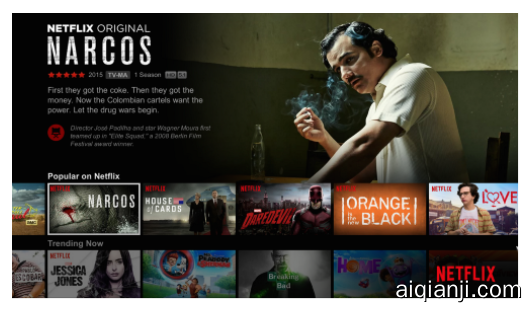
When a typical member comes to the above homepage the member glances at several details for each title including the display artwork (e.g. highlighted “Narcos” artwork in the “Popular on Netflix” row), title (“Narcos”), movie ratings (TV-MA), synopsis, star rating, etc. Through various studies, we found that our members look at the artwork first and then decide whether to look at additional details. Knowing that, we asked ourselves if we could improve the click-through rate for that first glance? To answer this question, we sought the support of our Creative Services team who work on creating compelling pieces of artwork that convey the emotion of the entire title in a single image, while staying true to the spirit. The Creative Services team worked with our studio partners and at times with our internal design team to create multiple artwork variants.
当一个用户来到首页(如上所示)时,用户可能会快速浏览影片的某些细节,例如影片封面(例如在“现在流行”行中的“毒枭”),影片名称(“毒枭”),影片评级(TV-MA),影片简介,星级评价等等。研究发现,用户往往先关注影片封面,然后再决定是否观看更多的信息。在此之上,我们思考能否在用户快速浏览时就提高影片点击率?为了回答这个问题,我们想影片创意部门寻求帮助,希望他们能够创造一些有说服力的影片封面,同时在一幅图中传递标题文字中的情绪,而且还能与视频内涵相符。因此,影片创意部门与影片工作室和内部设计师团队合作,制作了许多不同的影片封面。

Examples of artwork that were used in other contexts that don’t naturally lend themselves to be used on the Netflix service.
一些封面事例:他们可能在其他环境下表现不错,但是无法运用在Netflix上
Historically, this was a largely unexplored area at Netflix and in the industry in general. Netflix would get title images from our studio partners that were originally created for a variety of purposes. Some were intended for roadside billboards where they don’t live alongside other titles. Other images were sourced from DVD cover art which don’t work well in a grid layout in multiple form factors (TV, mobile, etc.). Knowing that, we set out to develop a data driven framework through which we can find the best artwork for each video, both in the context of the Netflix experience and with the goal of increasing overall engagement — not just move engagement from one title to another.反观而言,这是一个很大程度上未被Netflix研究的领域,甚至在整个工业界都没有被研究透。Netflix可以从他们工作室伙伴那儿得到许多封面,即使他们本身创造的目的不尽相同。某些是为了是为了放在路边公告牌上,其他的可能是作为DVD的封面。在此基础上,我们开始构建一个数据为基础的架构,一个我们能对每个影片找到最适合影片封面的架构,不仅仅是提升Netflix的用户体验,也是提高整体的用户交互,而不是将流量从一个影片导向另一个影片。
Testing our way into a better product通过检验改进产品
Broadly, Netflix’s A/B testing philosophy is about building incrementally, using data to drive decisions, and failing fast. When we have a complex area of testing such as image selection, we seek to prove out the hypothesis in incremental steps with increasing rigor and sophistication.
广而言之,Netflix的A/B测试哲学是一步一步构建,利用数据来驱动决策,而且快速响应失败。当我们在测试复杂的领域(如图像选择)时,我们通过一步一步更加严格和更加复杂的步骤,来渐进的检验我们的假设。
Testing our way into a better product 实验一:The Short Game
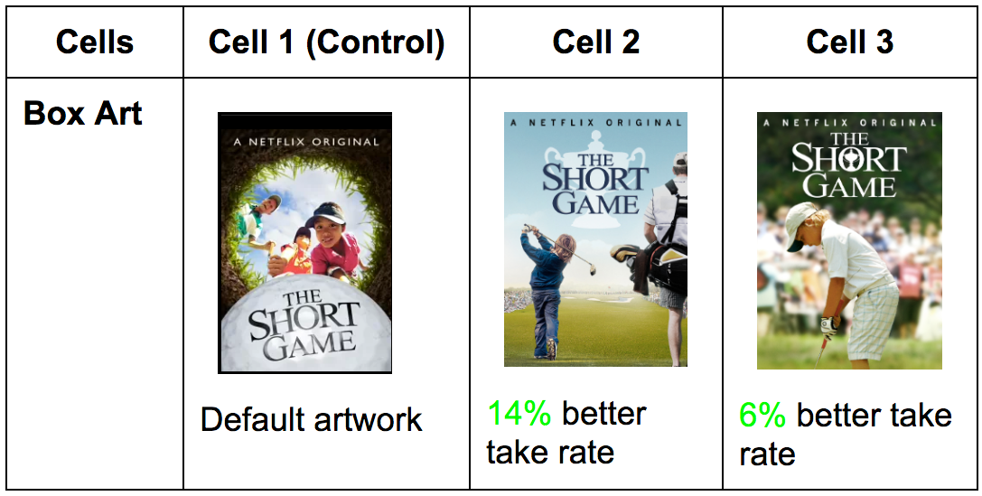
One of the earliest tests we ran was on the single title “The Short Game” — an inspiring story about several grade school students competing with each other in the game of golf. If you see the default artwork for this title you might not realize easily that it is about kids and skip right past it. Could we create a few artwork variants that increase the audience for a title?
最开始,我们对一个影片进行了测试,先对一个影片名“The Short Game“进行了测试,这个影片讲述了一个小学生在高尔夫球比赛中互相竞争的振奋人心的故事。如果你看默认的封面,你或许不能知道这个影片是关于小孩的,而且然后略过了这个影片。我们能够通过创造其他的封面来增加影片的观看人数吗?


To answer this question, we built a very simple A/B test where members in each test cell get a different image for that title. We measured the engagement with the title for each variant — click through rate, aggregate play duration, fraction of plays with short duration, fraction of content viewed (how far did you get through a movie or series), etc. Sure enough, we saw that we could widen the audience and increase engagement by using different artwork.
A skeptic might say that we may have simply moved hours to this title from other titles on the service. However, it was an early signal that members are sensitive to artwork changes. It was also a signal that there were better ways we could help our members find the types of stories they were looking for within the Netflix experience. Knowing this, we embarked on an incrementally larger test to see if we could build a similar positive effect on a larger set of titles.
为了回答这个问题,我们做了一个简单的A/B测试。每一类用户群体(cell)都对一部电影同一个标题会看到不同的影片封面。我们衡量每个不同的群体的用户交互——点击率,平均播放时间,只看短暂时间的比率,观看的总比率(看到了多少集或者电影长度),等等。当然,我们发现我们可以通过改变影片封面来让提高观看人数和提升用户交互。
对此抱有怀疑的人可能会说我们仅仅是将用户看其他影片的时间移到了这个影片来。但是,这是一个证明用户对影片封面敏感的证据。他也能证明我们可以帮助用户找到他们在Netflix想看的影片。在此基础上,我们尝试更多的测试,来看我们是否能在更多的影片中找到相类似的正面影响。
Experiment 2 (multi-cell explore-exploit test) 实验二(多个影片的探索利用测试)
The next experiment ran with a significantly larger set of titles across the popularity spectrum — both blockbusters and niche titles. The hypothesis for this test was that we can improve aggregate streaming hours for a large member allocation by selecting the best artwork across each of these titles.
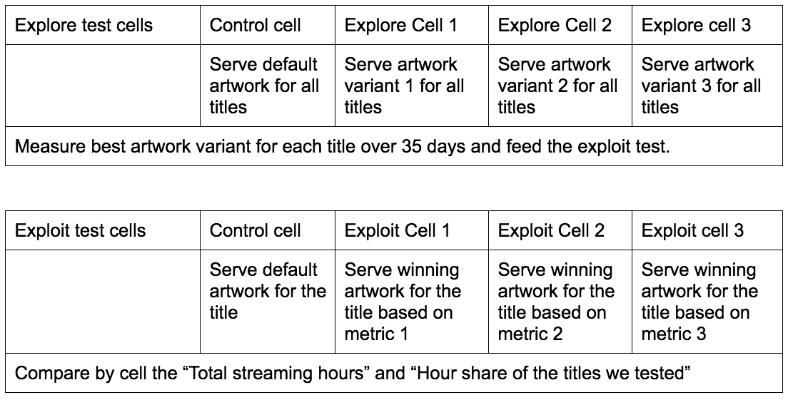
This test was constructed as a two part explore-exploit test. The “explore” test measured engagement of each candidate artwork for a set of titles. The “exploit” test served the most engaging artwork (from explore test) for future users and see if we can improve aggregate streaming hours.
在下一个测试中,我们把实验对象转变成成更多的影片——爆红影片和小影片。这类测试的假设是我们能够通过调整影片封面,来提高大部分用户的整体观看时间。
这个测试是有两个阶段:探索和检验。探索部分会衡量每一个封面对于用户交互的影响;检验部分会将(从探索部分中找到的)最优的封面应用到未来的实际用户中,看是否能提高整体观看时间。


Using the explore member population, we measured the take rate (click-through rate) of all artwork variants for each title. We computed take rate by dividing number of plays (barring very short plays) by the number of impressions on the device. We had several choices for the take rate metric across different grains:
- Should we include members who watch a few minutes of a title, or just those who watched an entire episode, or those who watched the entire show?
- Should we aggregate take rate at the country level, region level, or across global population?
Using offline modeling, we narrowed our choices to 3 different take rate metrics using a combination of the above factors. Here is a pictorial summary of how the two tests were connected.
从测试用户数据中,我们衡量了每个影片的点击次数。我们利用点击次数信息(减去非常短观看的点击),除以一共被展示的次数,便能计算出用户点击率。我们在计算点击次数的时候也有一些需要考虑的因素:
- 我们应该只计算看了影片至少几分钟的用户,还是只计算看完了整集的用户,抑或是只计算看完了整个剧情的用户?
- 我们应该计算每个国家的观看率,还是地区的观看率,或者是全球的观看率呢?
在离线建模中,我们缩小到只考虑三个点击率相关的度量。下图展示这两种测试是如何联系起来的。

The results from this test were unambiguous — we significantly raised view share of the titles testing multiple variants of the artwork and we were also able to raise aggregate streaming hours. It proved that we weren’t simply shifting hours. Showing members more relevant artwork drove them to watch more of something they have not discovered earlier. We also verified that we did not negatively affect secondary metrics like short duration plays, fraction of content viewed, etc. We did additional longitudinal A/B tests over many months to ensure that simply changing artwork periodically is not as good as finding a better performing artwork and demonstrated the gains don’t just come from changing the artwork.
这个测验的结果非常明显:我们不仅仅只是将用户引流到不同影片,而是显著提高了每一个影片的观看率,并成功地提高了整体的用户观看时间。给用户展示更加切合的封面让他们观看了他们以前可能会错过的影片。我们也通过二级标准:例如短时播放量,内容观看比率等等证实了没有负面影响。我们做了其他超过几个月的纵向的A/B测试,证明如果仅仅是周期性的改变影片封面,并不会比找到表现出色的封面表现更好。
There were engineering challenges as we pursued this test. We had to invest in two major areas — collecting impression data consistently across devices at scale and across time.
在我们进行这类测试时,我们也遇到了一些工程上的问题。我们需要从维度和时间上考虑:如何在任何设备上,大规模地,跨时间地,稳定持续性地收集用户数据。
- Client side impression tracking: One of the key components to measuring take rate is knowing how often a title image came into the viewport on the device (impressions). This meant that every major device platform needed to track every image that came into the viewport when a member stopped to consider it even for a fraction of a second. Every one of these micro-events is compacted and sent periodically as a part of the member session data. Every device should consistently measure impressions even though scrolling on an iPad is very different than the navigation on a TV. We collect billions of such impressions daily with low loss rate across every stage in the network — a low storage device might evict events before successfully sending them, lossiness on the network, etc.
用户数据收集:计算观看率的一个重要前提条件就是能够知道有多少影片被显示和被点击。这意味着任何设备上,我们需要追踪每一个展示图来的图像,也要追踪用户是否观看(即使仅仅不到一秒)。每一个如此的小事件都需要周期性的打包传送到我们的用户数据中。每一个设备都应该稳定持续的收集数据,即使知道在iPad上的浏览和在电视上浏览很不相同。我们每天收集超过数十亿的显示数据,并且保证数据流失非常的低——有时小存储设备可能在成功发送数据前就遗失了数据,或者网络故障,等等。 - Stable identifiers for each artwork: An area that was surprisingly challenging was creating stable unique ids for each artwork. Our Creative Services team steadily makes changes to the artwork — changing title treatment, touching up to improve quality, sourcing higher resolution artwork, etc.
稳定的封面表达系统:一个让人意外的有挑战性的问题是如何对每个封面创造独特的表达系统。我们的创意服务团队经常对于封面进行修改——改标题,小幅度修改,或者提高分辨率等等。

The above diagram shows the anatomy of the artwork — it contains the background image, a localized title treatment in most languages we support, an optional ‘new episode’ badge, and a Netflix logo for any of our original content.
上图就是封面的一个解析——它包含一个背景画面,一个翻译过的当地化的的标题,一个可选的新剧情的标记,一个代表原创内容的Netflix标志。

These two images have different aspect ratios and localized title treatments but have the same lineage ID.
So, we created a system that automatically grouped artwork that had different aspect ratios, crops, touch ups, localized title treatments but had the same background image. Images that share the same background image were associated with the same “lineage ID”.
因此,我们创造了一个能够自动将插画进行组合的系统,即使他们有不同的横纵比,当地化的标题,润色,但只要他们有相同的背景画面。拥有相同背景画面的插画分享同一个“血统ID”。
Even as Creative Services changed the title treatment and the crop, we logged the data using the lineage ID of the artwork. Our algorithms can combine data from our global member base even as their preferred locale varied. This improved our data particularly in smaller countries and less common languages.
即使创意服务团队经常改变标题,但我们利用血统ID追踪封面。我们的算法能够结合全球用户的数据,即使他们有不同的偏向使用的语言。这提高了我们的数据,尤其在小国家或者小语言使用地区。
Experiment 3 (single cell title level explore test) 实验三(单个影片的探索测试)
While the earlier experiment was successful, there are faster and more equitable ways to learn the performance of an artwork. We wish to impose on the fewest number of randomly selected members for the least amount of time before we can confidently determine the best artwork for every title on the service.
即使前面的实验都非常成功,我们也能找到更快且更公平的衡量封面表现的方法。我们希望利用更少的随机选取的用户,更少的时间,来帮助我们更自信的找到每个影片最合适的封面。

Experiment 2 pre-allocated each title into several equal sized cells — one per artwork variant. We potentially wasted impressions because every image, including known under-performing ones, continue to get impressions for many days. Also, based on the allocation size, say 2 million members, we would accurately detect performance of images for popular titles but not for niche titles due to sample size. If we allocated a lot more members, say 20 million members, then we would accurately learn performance of artwork for niche titles but we would be over exposing poor performing artwork of the popular titles.
在实验二中,每一个影片都将用户分成等数量的类别,然后每一个类别分配一种不同的封面。我们其实浪费了很多展示资源,因为每一个封面,即使是已知的表现不好的那些,都会持续的得到展示。而且,基于展示的用户数量,例如说两百万用户,我们能够精确的测量那些流行的影片,它们封面的表现情况,但是对于不流行的影片,因为观看用户量少,可能无法准确衡量。如果我们要增加展示的用户数量,例如说将曝光的用户增加到两千万,那我们可能能够知道小影片的封面表现情况,但是流行影片因为点击率高,那么一些效果不好的封面图的曝光率也变高了。
Experiment 2 did not handle dynamic changes to the number of images that needed evaluation. i.e. we could not evaluate 10 images for a popular title while evaluating just 2 for another.
实验二并没有动态改变所需要测试的图片数量。例如说我们不能对流行的影片测试10种封面效果,但是对于其他的影片,只测试两种。
We tried to address all of these limitations in the design for a new “title level explore test”. In this new experiment, all members of the explore population are in a single cell. We dynamically assign an artwork variant for every (member, title) pair just before the title gets shown to the member. In essence, we are performing the A/B test for every title with a cell for each artwork. Since the allocation happens at the title level, we are now able to accommodate different number of artwork variants per title.
我们尝试通过设计一种新的“影片级别的探索测试”来改进这些缺陷。在这个新的实验中,所有曝光用户都在同一个元件里。在数据曝光之前,我们动态的计算出对每对(用户,影片)分配的封面图。简而言之,我们是对于每个影片的每个封面来进行A/B测试。因为这时的分配发生在封面图层面,我们现在就可以对不同的封面,不同的影片来进行分配。
This new test design allowed us to get results even faster than experiment 2 since the first N members, say 1 million, who see a title could be used to evaluate performance of its image variants. We continue to stay in explore phase as long as it takes for us to determine a significant winner — typically a few days. After that, we exploit the win and all members enjoy the benefit by seeing the winning artwork.
这个新的测试设计让我们能够比实验二更快的观察到结果,因为最先的N个用户,例如说一百万人,能够被用来衡量封面图的表现。我们也能在测试算法中持续性的跟踪,直到我们能够显著性的发现一个最好的封面——经常几天时间内。之后,我们就会利用优胜者,让所有的会员享受看到最好的封面的福利。
Here are some screenshots from the tool that we use to track relative artwork performance.
这是一些追踪封面表现工具的截图。
**驯龙记:飞越边界 **两个标记的封面显著的比其他的封面要表现优秀。
Dragons: Race to the Edge: the two marked images below significantly outperformed all others.


Conclusion 结论
Over the course of this series of tests, we have found many interesting trends among the winning images as detailed in this blog post. =Images that have expressive facial emotion that conveys the tone of the title do particularly well.= Our framework needs to account for the fact that winning images might be quite different in various parts of the world. Artwork featuring recognizable or polarizing characters from the title tend to do well. Selecting the best artwork has improved the Netflix product experience in material ways. We were able to help our members find and enjoy titles faster.
在不断的测验后,我们发现最优封面图的一些有趣的趋势(见这个[文章]((https://media.netflix.com/en/company-blog/the-power-of-a-picture))。**有面部表情,并且表情传递影片内涵的封面图往往表现不错。**我们的架构需要解释最优封面图往往会在世界不同地区有所差异。展示影片中有辨识度或者有对比度的角色的封面往往表现良好。寻找最优的封面图大大提升Netflix的产品体验。我们帮助我们的会员更快的找到和享受影片。
We are far from done when it comes to improving artwork selection. We have several dimensions along which we continue to experiment. Can we move beyond artwork and optimize across all asset types (artwork, motion billboards, trailers, montages, etc.) and choose between the best asset types for a title on a single canvas?
但对于封面图选择我们还有很大的提升空间。我们还有很多持续检测的维度。除了封面图,我们是否能够尝试其他的组合优化,如(动态展示图,预告片等等)然后对每个影片都选择最优的呢?
This project brought together the many strengths of Netflix including a deep partnership between best-in-class engineering teams, our Creative Services design team, and our studio partners. If you are interested in joining us on such exciting pursuits, then please look at our open job descriptions around product innovation and machine learning.
— Gopal Krishnan
(on behalf of the teams that collaborated)

